Brand systems · Identity · Communication design
Senior Communication and Graphic Design Specialist at ELCA Group.
I like to meet people, talk and listen. That is where the best connections happen, and where the truest picture of a brand appears. What you want your brand to say goes beyond a style or a need: it is a way of being and of seeing life. Capturing that essence is what I do.
Selected work
Open any project for the brief, the idea and what was delivered.
Services
From a new brand to an existing one that has outgrown its files.
The pieces a brand actually lives on.
Full campaigns made with AI, always directed by brand rules.
How I work
Clear rounds, clear payments, and you in the room at every decision that matters.
01Proposal
02Discovery
03Creation
04Delivery
About
Every project starts with a conversation. I listen for what a brand wants to be, not only what it needs, and build the system that carries it.
More than seven years of practice back that process. Today I work for a Swiss technology group, I have built my own art project, and I keep feeding what I know every day.
A 360° perspective
“My priority is to build work that reflects what a brand truly is, and what it needs to become.”Isabel Fuertes, founder of ISYSNT
Experience
Brand system for seven entities, events and sponsorships, annual and sustainability reporting, internal communication.
Independent brand and design practice.
Launch strategy for an hourly job platform. Qualified leads up 1,000%.
Brand, web and content system for an AI academy: 200K subscribers, 4,000+ students.
Questions
A working brand system, not just a logo file: identity, rules, templates and the first real applications, documented so your team can run it without me.
No. A lot of my work is evolving brands that already have recognition. Alesves kept its colours and structure. ELCA kept its 58-year-old symbol and got the rules it never had.
One on the quote, two on the briefing, up to two visual and verbal routes, and up to two rounds between design and presentation. Anything beyond a change of direction is quoted separately.
A first payment on accepting the quote, which is when the project starts, and a final payment after the full review, before the final delivery.
Both. Positioning, tone of voice and copy come before form. I write in English and Spanish.
Directed by brand rules, never the other way round. I wrote the AI imagery rules at ELCA and produce full campaigns with Magnific and Claude.
Barcelona, working remotely with teams in Switzerland, Vietnam, Mauritius, Spain and Italy.
Senior Communication & Graphic Design Specialist at ELCA Group, Switzerland: brand system, events, reporting and internal communication across seven entities. Alongside it, I run ISYSNT, my own art and design project.
The project starts once all necessary material and the agreed advance payment have been received.
If the client cancels after the start, the advance payment is not refunded.
If ISYSNT DESIGN stops providing the service for any reason, it is paid for the work done up to that date.
The full agreed amount is due even if the client later does not use the design, for reasons outside ISYSNT DESIGN’s control.
The client delivers the necessary information and documentation on time. Otherwise, partial and final deadlines may move.
If ISYSNT DESIGN received everything on time and misses a deadline, the client may claim a 10% discount on the agreed price.
Extra work caused by a change of direction is not included. It will be communicated and quoted separately.
Resources not in the quote, such as photography, illustration, icons, infographics or specific stock, are supplied by the client or quoted separately. Once paid, their rights belong to the client.
The client reviews design, text and data before any printing, reproduction or publication. ISYSNT DESIGN is not liable for errors after approval.
Any change to the design by the client or a third party is first checked with ISYSNT DESIGN, to make sure it meets quality standards before it is presented or published.
Proposals presented and not accepted remain the property of ISYSNT DESIGN as their author.
ISYSNT DESIGN may show completed work on its website and platforms such as YouTube, Instagram and Behance.
Where the project includes typefaces, photography, illustration or other resources owned by ISYSNT DESIGN, editable source files are only delivered if specified in the quote and the client holds the licences for all material used.
Exploitation rights stay with ISYSNT DESIGN until 100% of the payment has been made.
Contact
New brand, refresh, or a system your team can finally run. Tell me where it stands.
Current role · 2025 – present
Swiss IT group, 2,300+ people, founded 1968. I rebuilt its brand across seven entities and produce what it runs on.
The brief
A 58-year-old brand with strong recognition and almost nothing written down. Seven entities, four office centres and three languages, with every new file drifting a little further from the last.
The idea
Write the system that did not exist, then prove it on everything the group produces: sponsorships, trade fairs, partner events, reports and internal campaigns.
“Crafting Switzerland’s digital transformation. Since 1968.”
Brand system
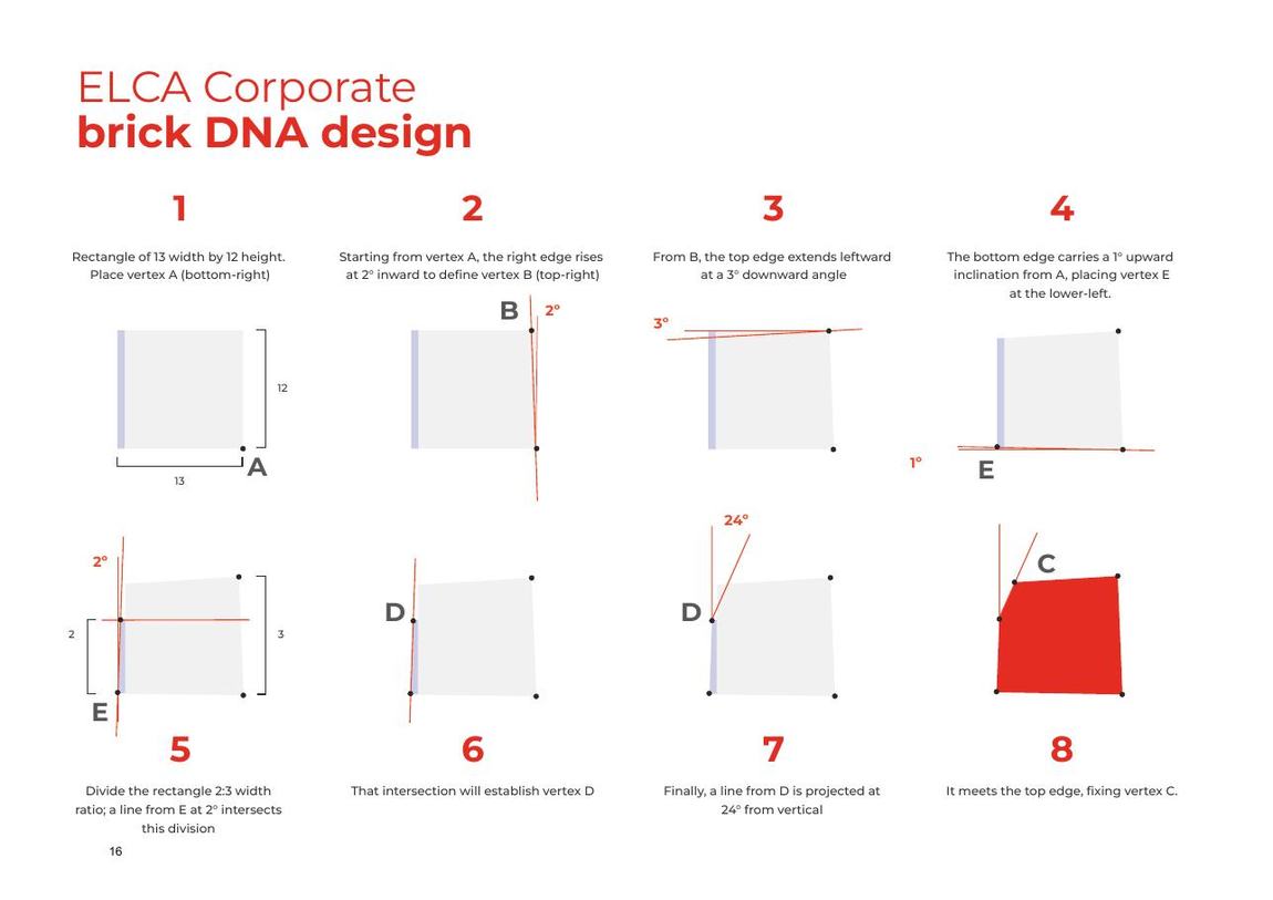
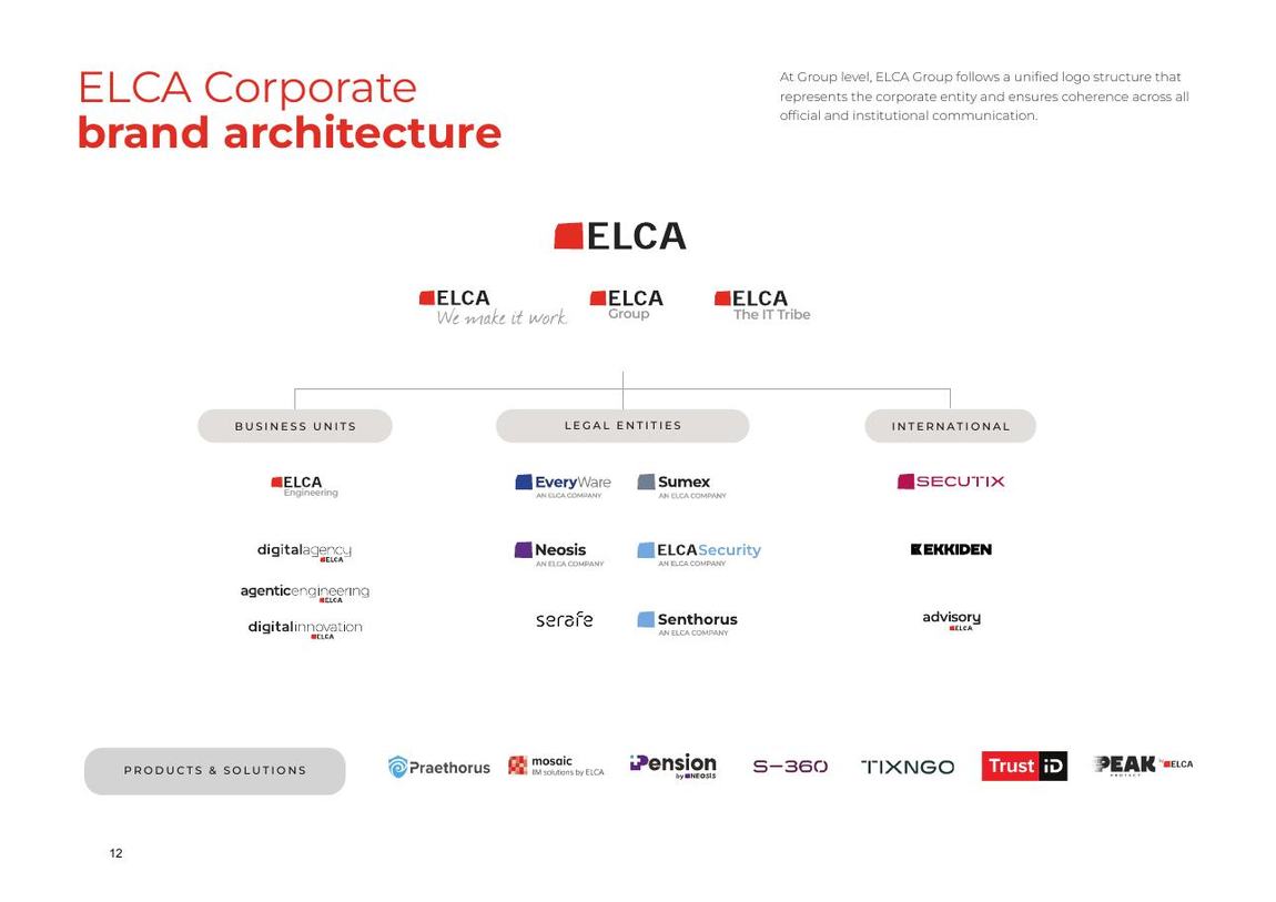
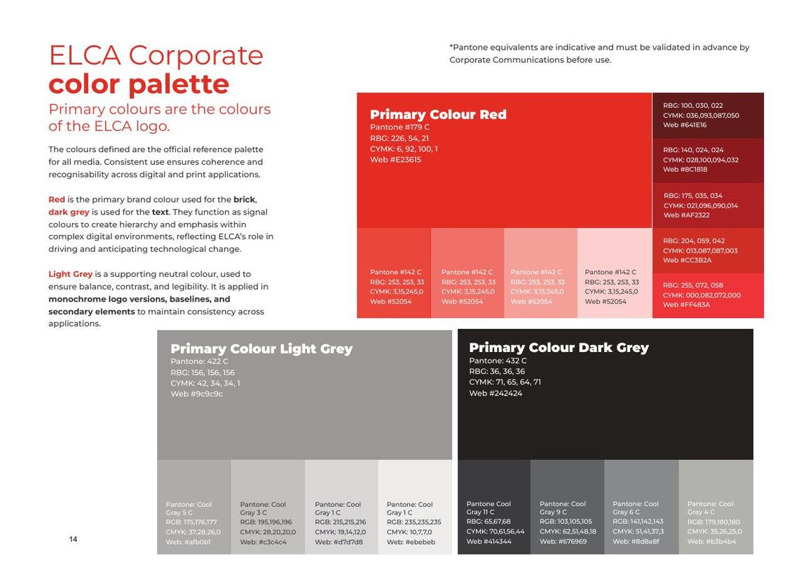
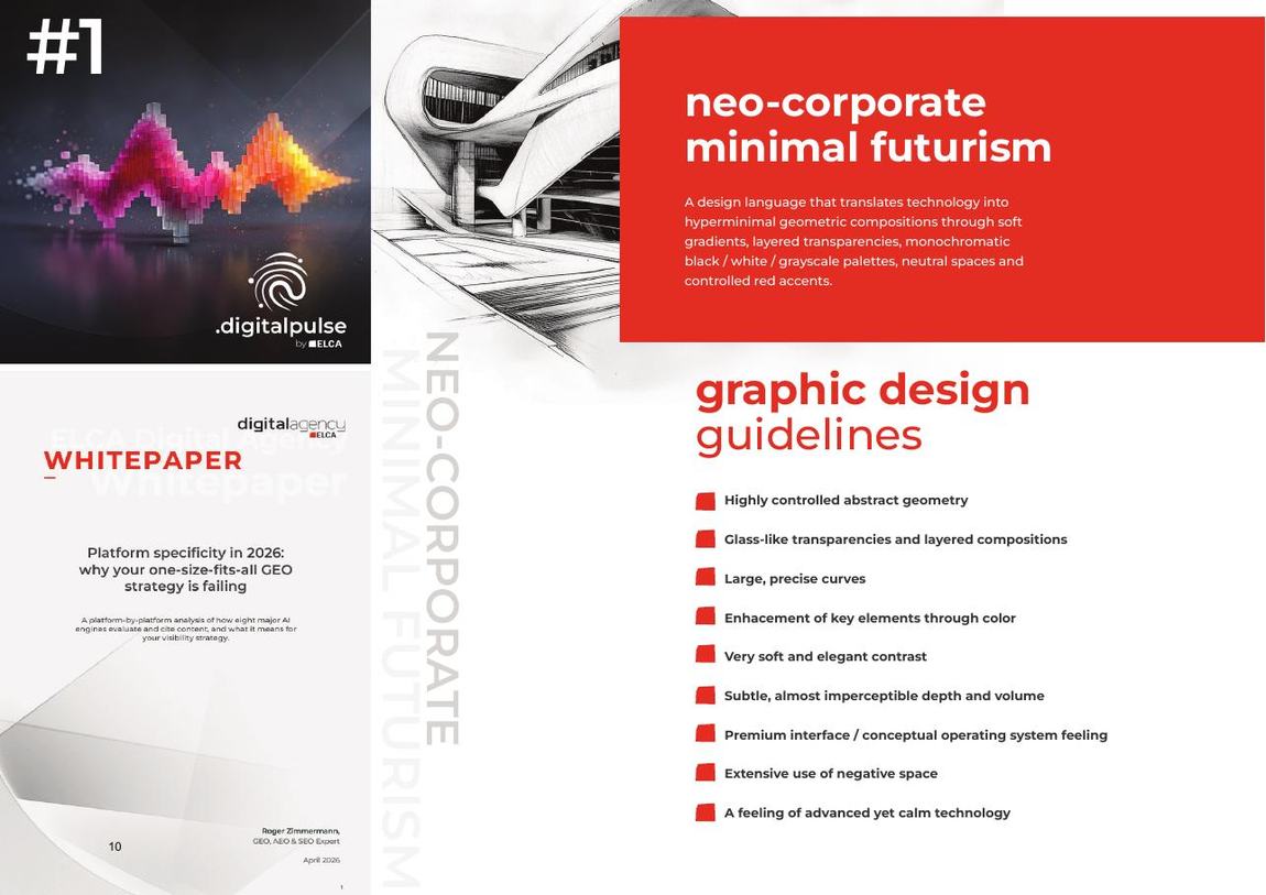
The brick had been redrawn for decades with no construction on record. It is now fixed geometrically, with proportions set to musical intervals, so no redraw drifts again.
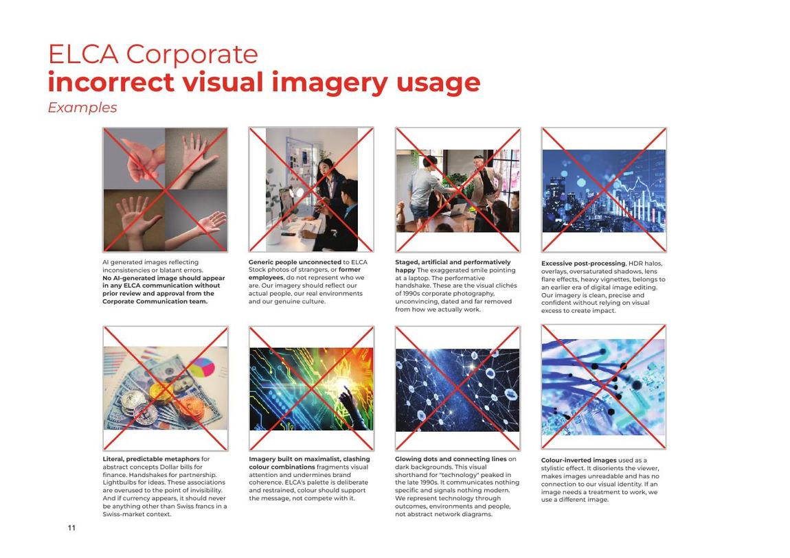
The imagery section names eight banned patterns, each with a reason. Guidelines that only show good examples never get enforced.
Every subsidiary reads as itself and as ELCA at the same time, on any background.
Events & sponsorship
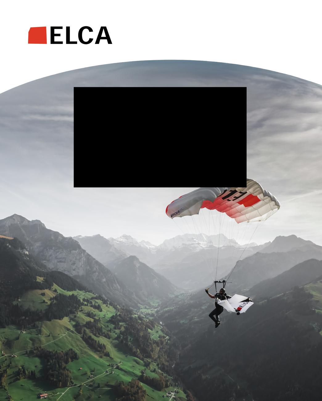
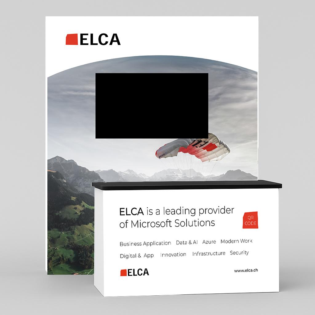

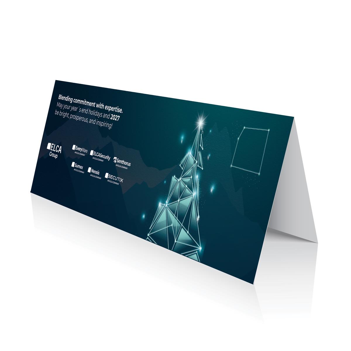
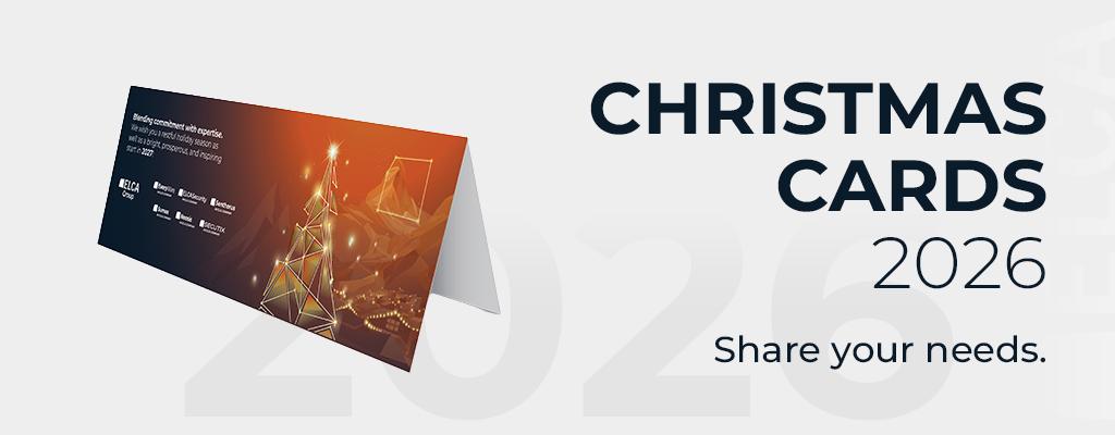
Seasonal
Reporting
Design and editorial production of the group’s reporting: long-form narrative, data and regulated disclosure held in one system, with employee testimonials used to make the numbers human.
What I delivered
Result
A brand that people outside the room can now run correctly, across festivals, fairs, partner events, reports and internal channels.
Start a similar projectLatest project · 2026
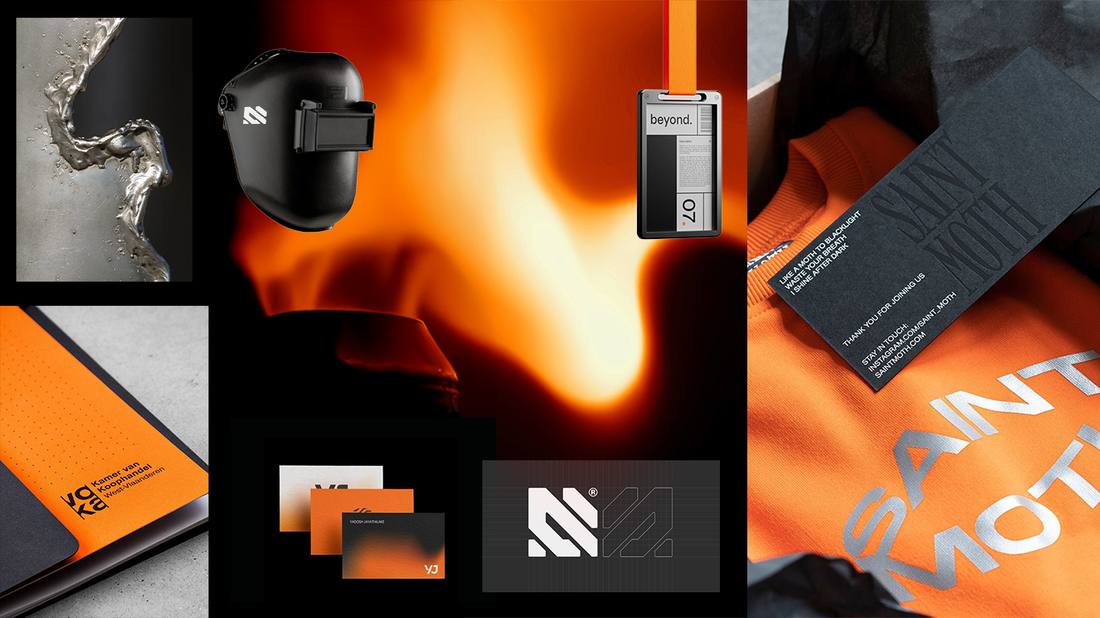
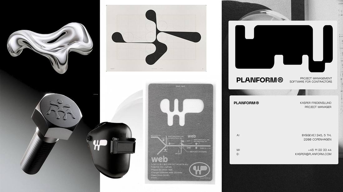
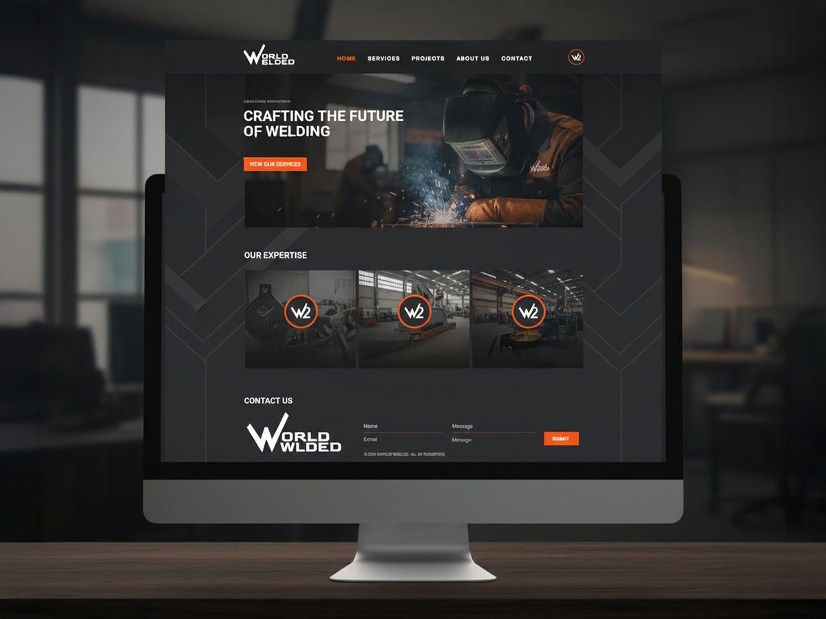
Two welders working in the Dutch industrial sector. A brand built from the trade itself.
The brief
High technical skill and no identity. A trade where every decision affects safety, with a brand that said nothing about that standard.
The idea
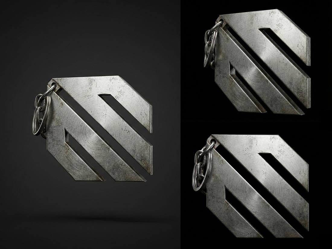
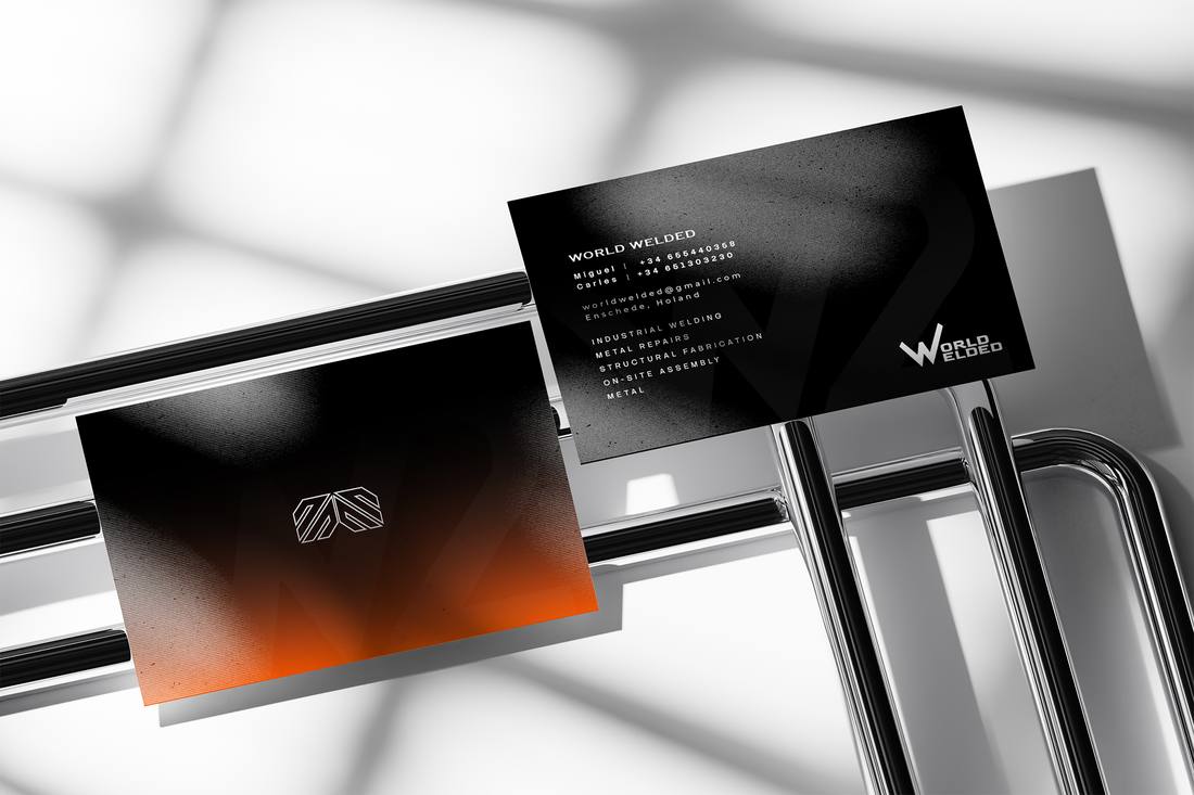
Two V’s welded into one W. The mark carries the two founders and the join itself.
“The brand is built like a structure: it only grows when the base allows it.”
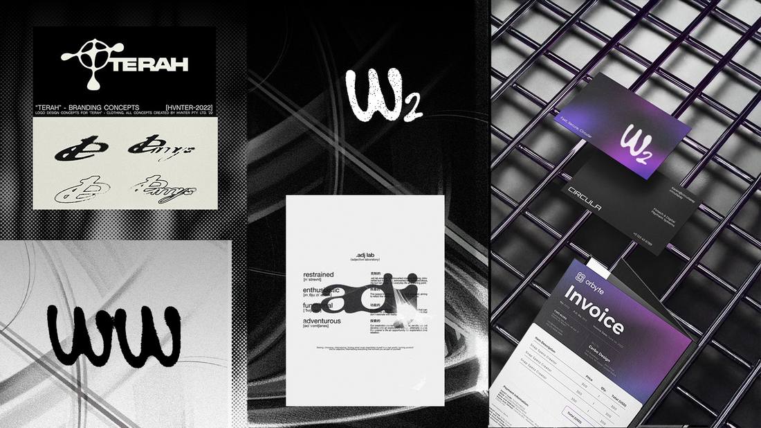
Three universes


The client chose between three complete brand worlds before any logo existed. The decision was made on direction, not on a sketch.
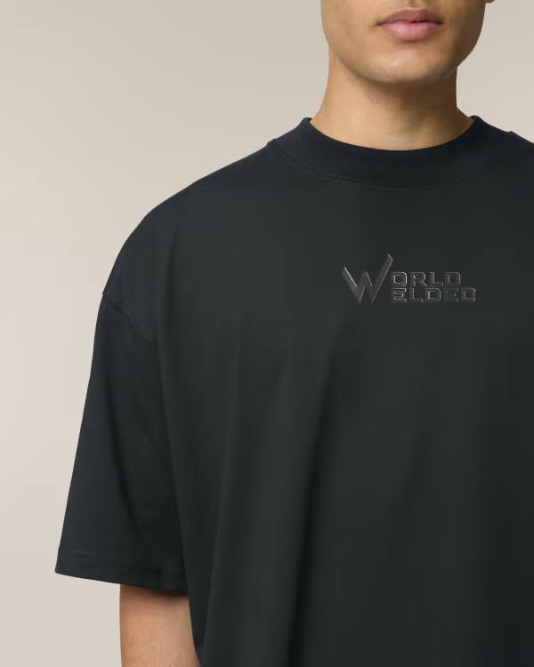
A solid version of the icon exists because a fine line disappears in embroidery and cut vinyl.
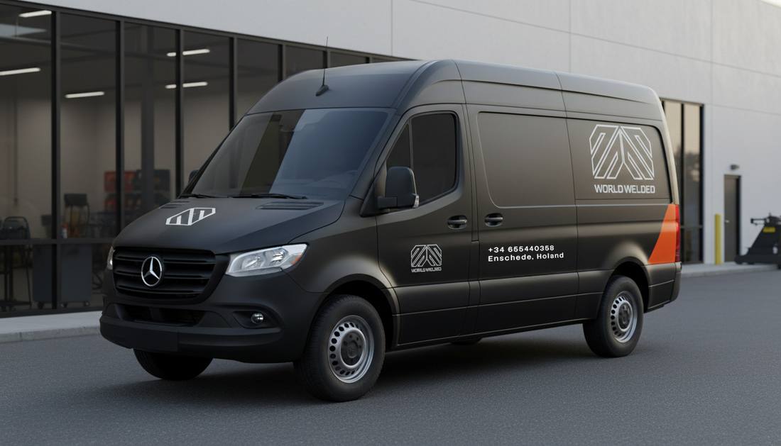
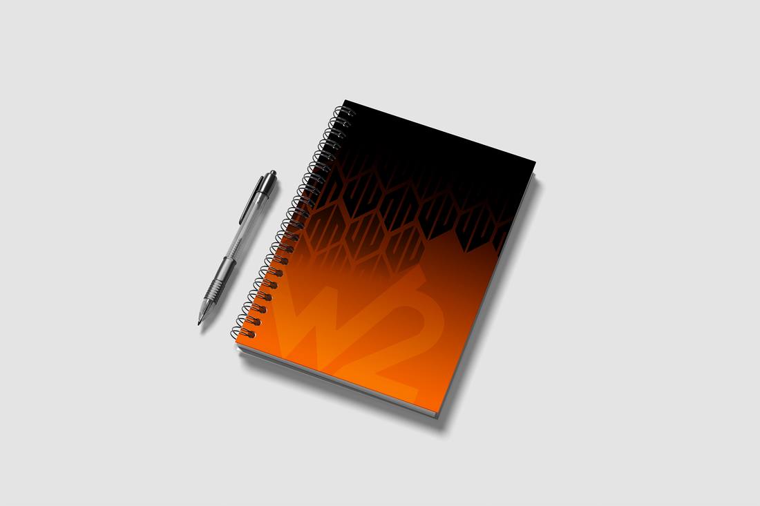
Vivid orange marks the point of heat. Everything else stays industrial.
Identity


Applications


What I delivered
Result
Launched with every asset a two-person business needs, from the van to the website, and the rules to keep it consistent.
Start a similar projectIn-house · 2022 – 2024
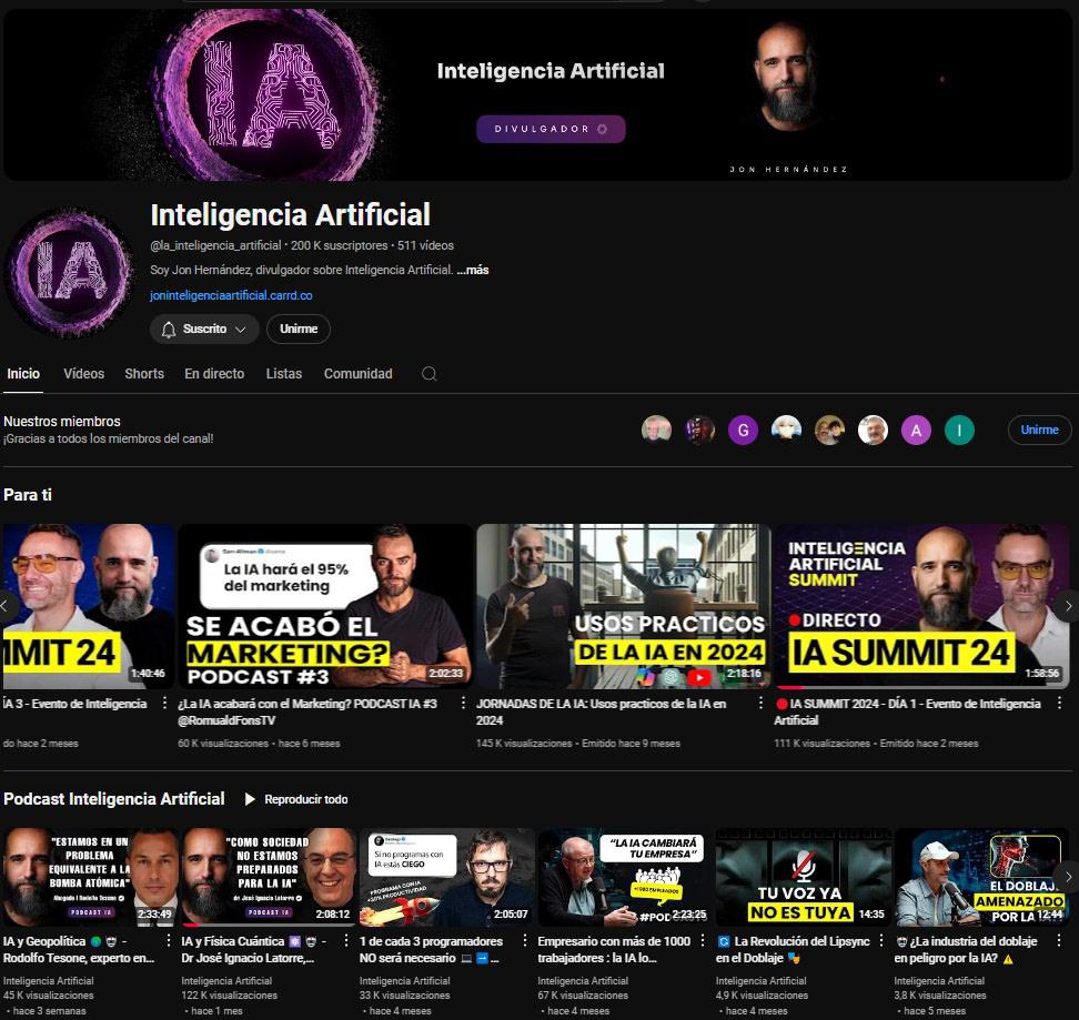
An AI academy that grew to 200K subscribers and 4,000+ students. I designed the system it ran on.
The brief
The subject changes every week. Anything designed piece by piece becomes unmanageable by the third month.
The idea
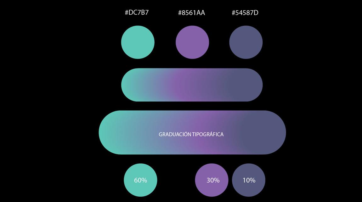
Fix the decisions once so publishing never needs one: three colours with a fixed ratio, templated thumbnails and one-decision sales pages.
Channel & system


Videos are seen side by side. Each series has its own treatment, so the channel reads as a catalogue.
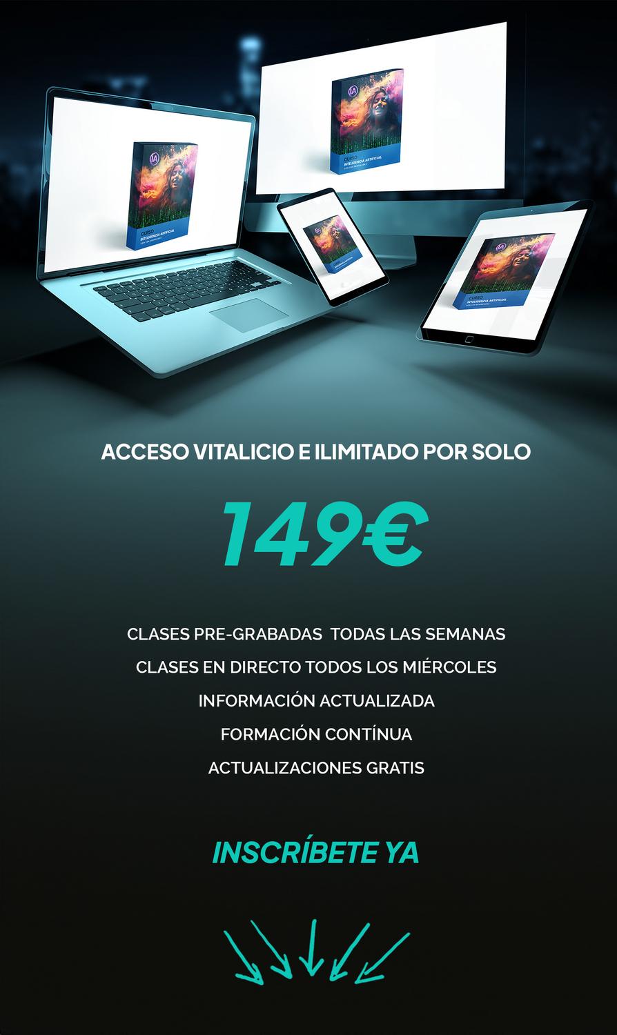
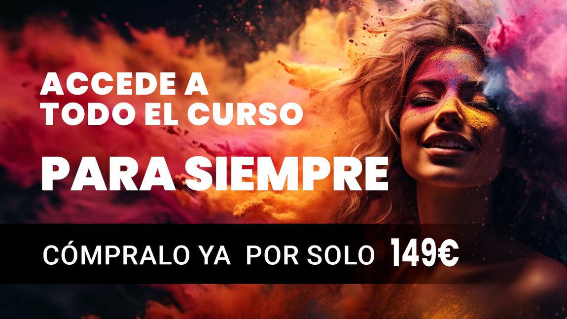
One product, one price and identical wording on every surface. The offer never looks like it changes.
iaperfecta.com separates curated picks from the open catalogue, so it holds hundreds of tools without a redesign.
Conversion


Web
Full site design, popup included. Development by a collaborating programmer.
What I delivered
Result
A system run at volume: 511 videos, two courses, and the funnels that took viewers from a free video to a paid enrolment.
Start a similar projectE-commerce campaigns
Two fragrance brands, one problem: selling a scent through a screen.
The brief
You cannot smell a perfume online. Every screen has to do the work of a tester strip, and give a reason to buy today.
The idea
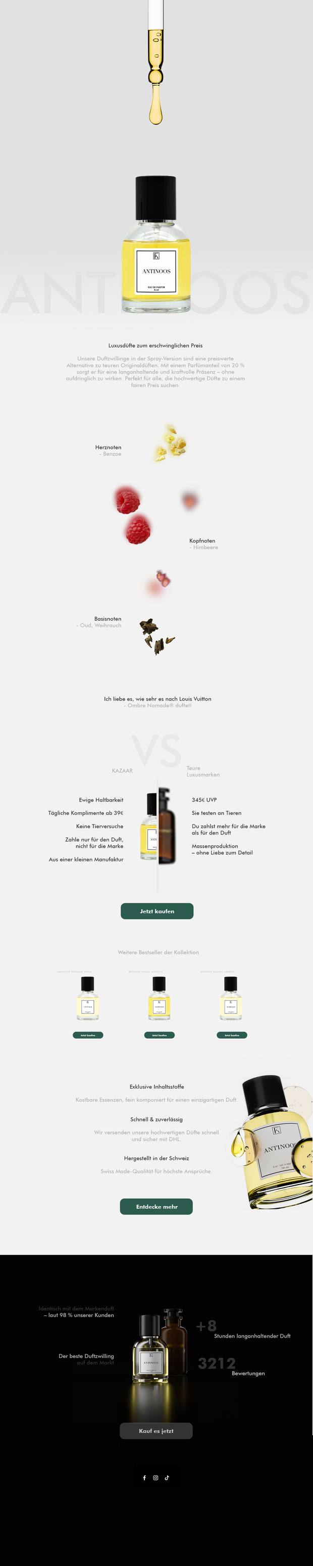
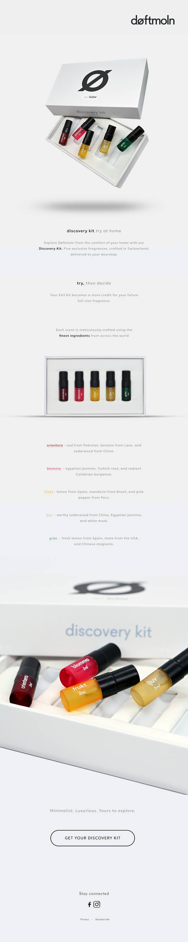
Make the scent physical. Drops, notes and raw ingredients you can almost touch, with one clear offer repeated in the same words.
Scroll inside each page


Social


The product email breaks the fragrance into its notes, raspberry, benzoin, oud, so the customer reads the smell before buying.
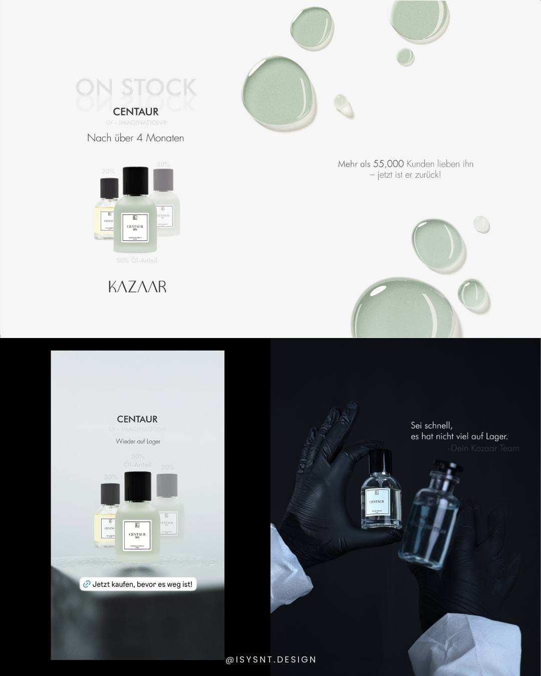
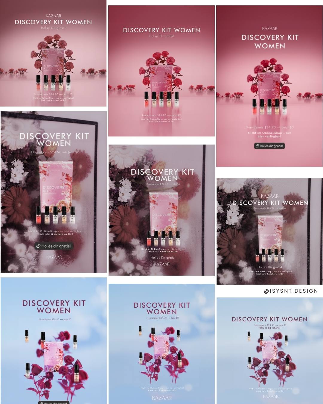
A countdown and one discount, repeated identically. No shouting, just a date.
Kazaar sells value against luxury labels. Døftmoln sells calm Swiss minimalism and a kit that turns into store credit.
What I delivered
Result
Campaign assets that turn a product people cannot smell online into something they can read, see and want.
Start a similar projectPackaging
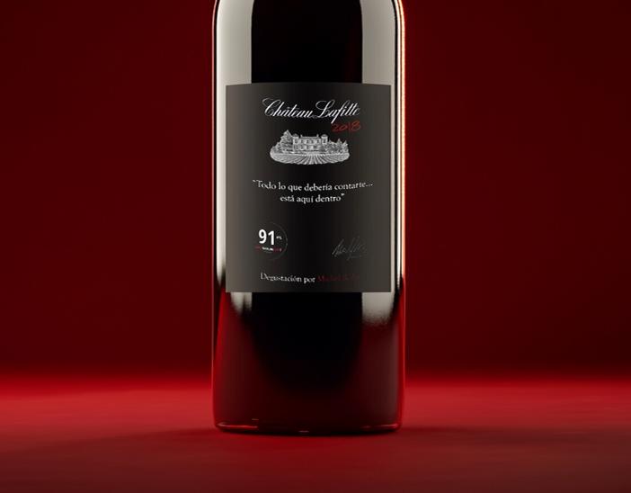
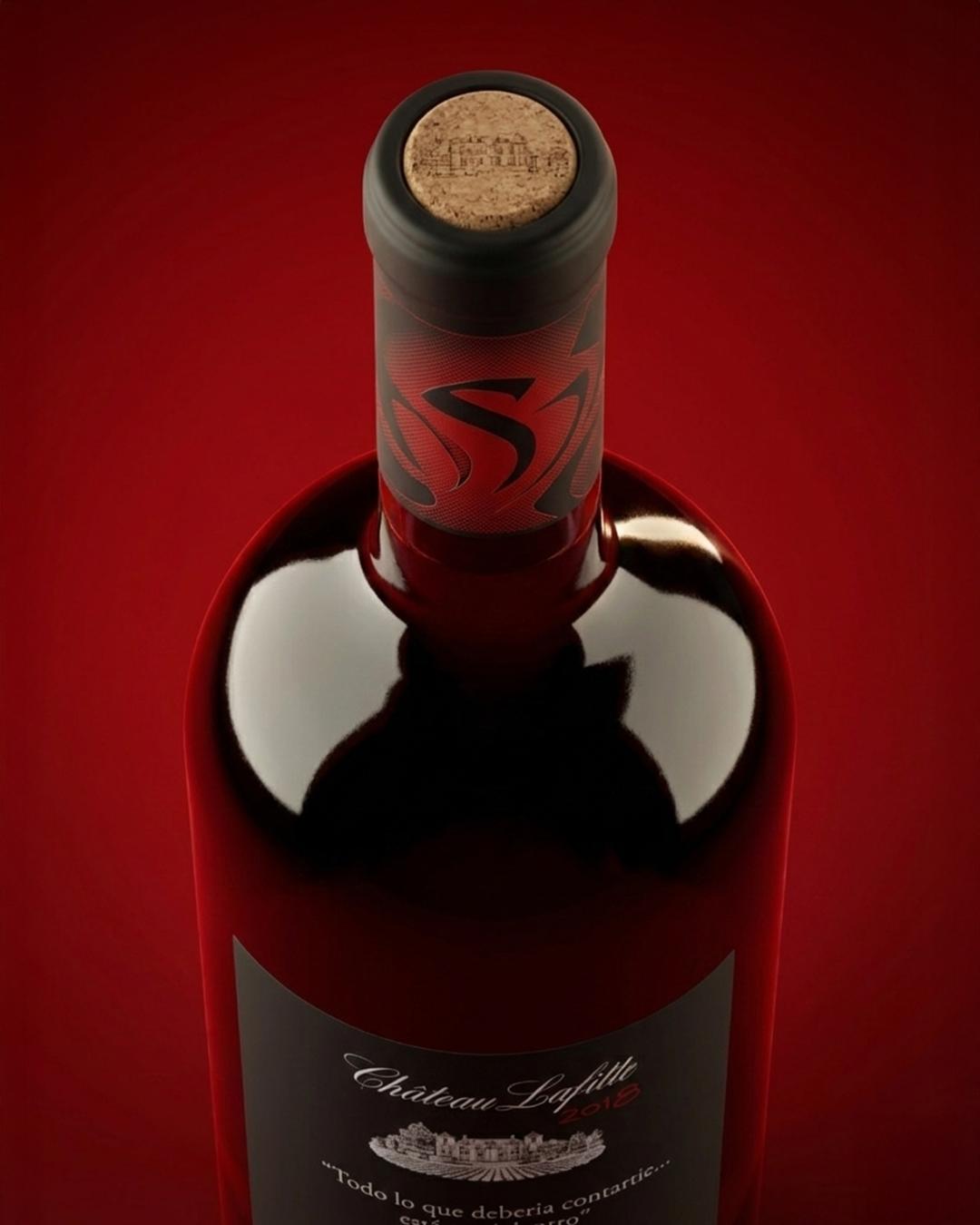
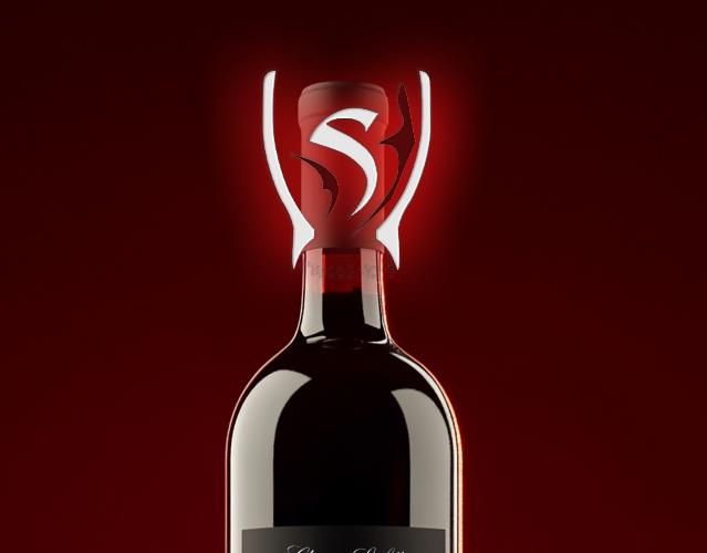
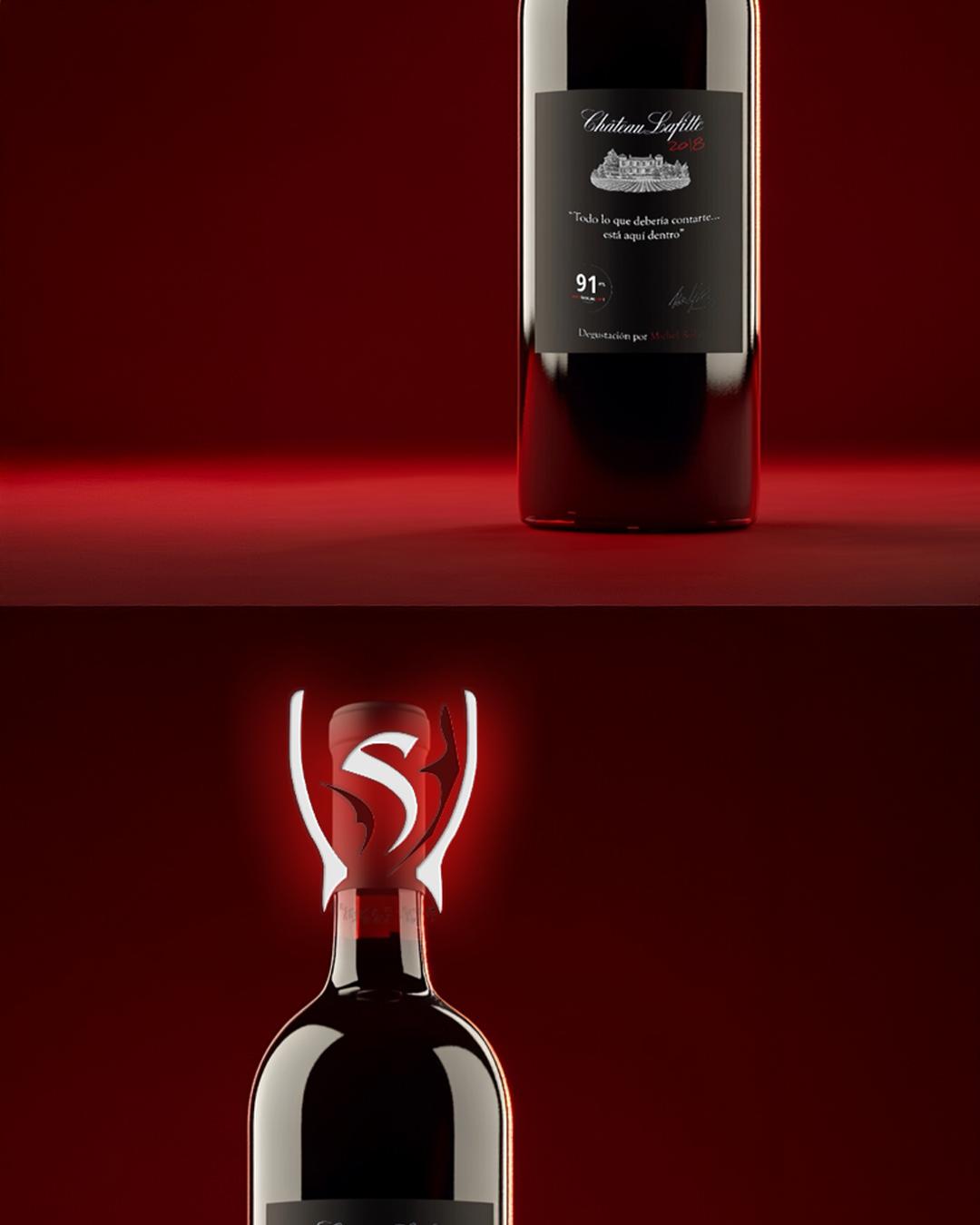
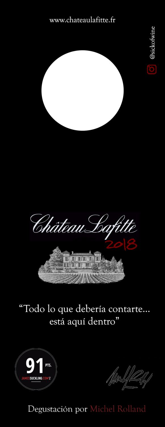
Château Lafitte 2018. A quiet label and a neck tag that tells the story.
The brief
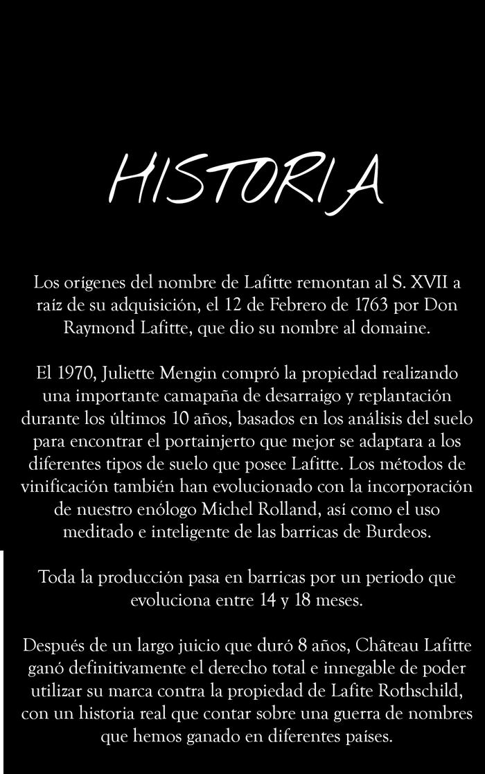
A wine with a real story, including an eight-year legal fight over its own name, and a 100 mm label with nowhere to put it.
The idea
Split the message. The label holds identity and proof. The neck tag holds the history. One line on the bottle connects them.
“Todo lo que debería contarte… está aquí dentro.”


The 91-point score sits at the bottom as verification. Set large, it turns the bottle into a shelf-talker.
The cork carries the estate engraving, so the identity survives the bottle being opened.
What I delivered
Result
Packaging built as a two-part system: identity on the bottle, story in the hand.
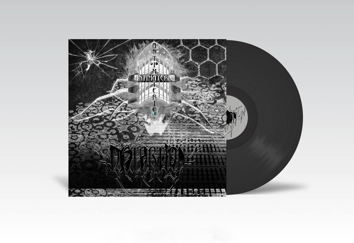
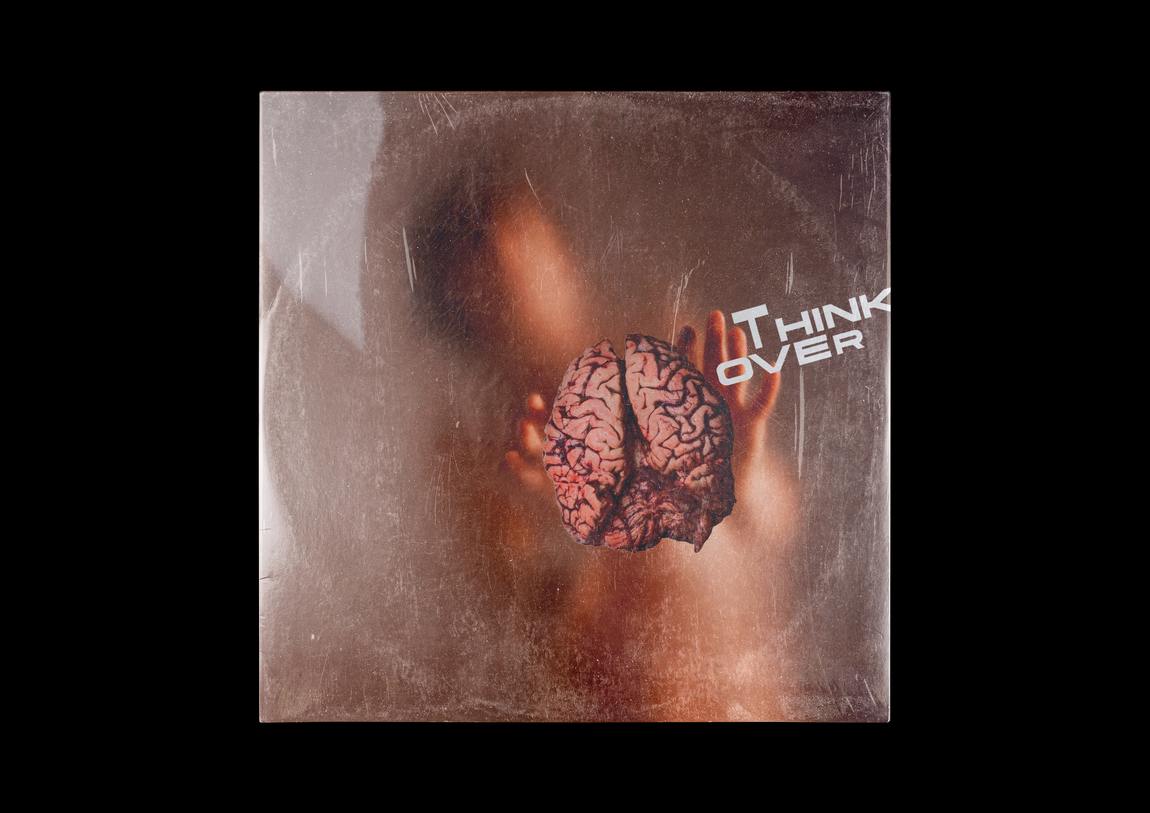
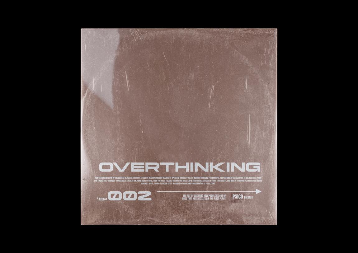
Start a similar projectRecord sleeves · 5 releases
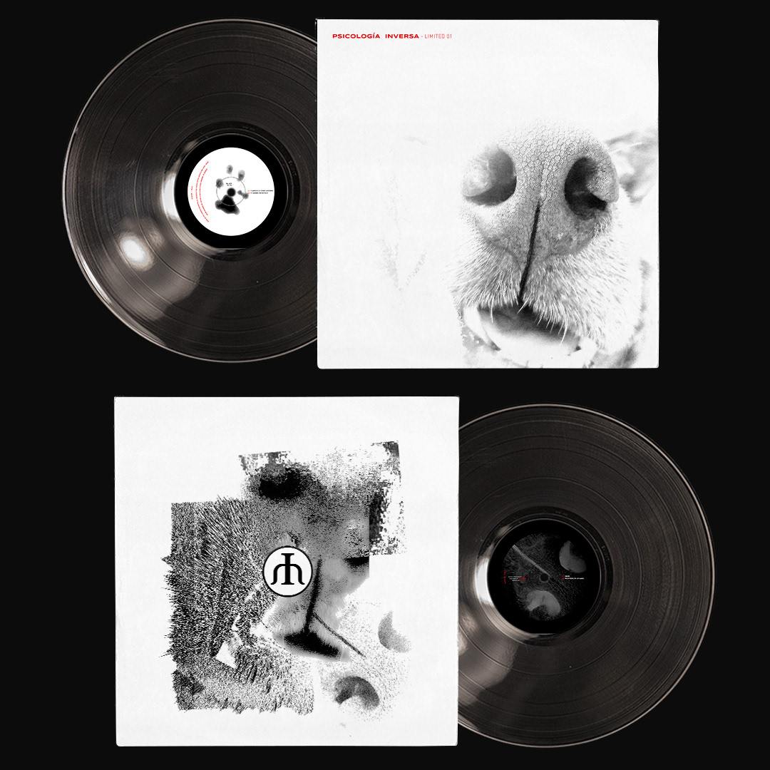
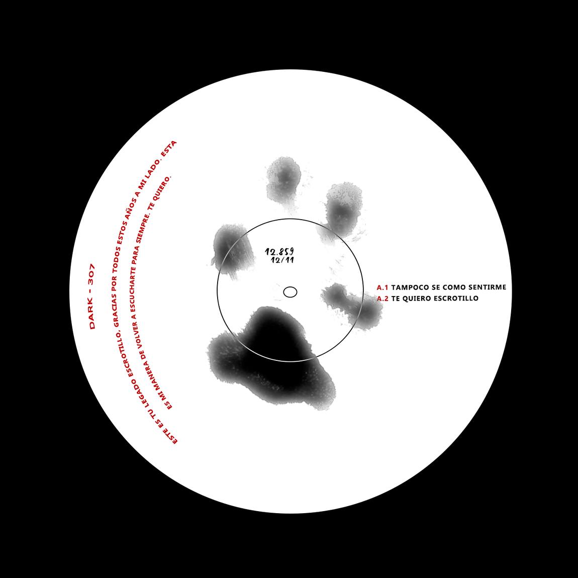
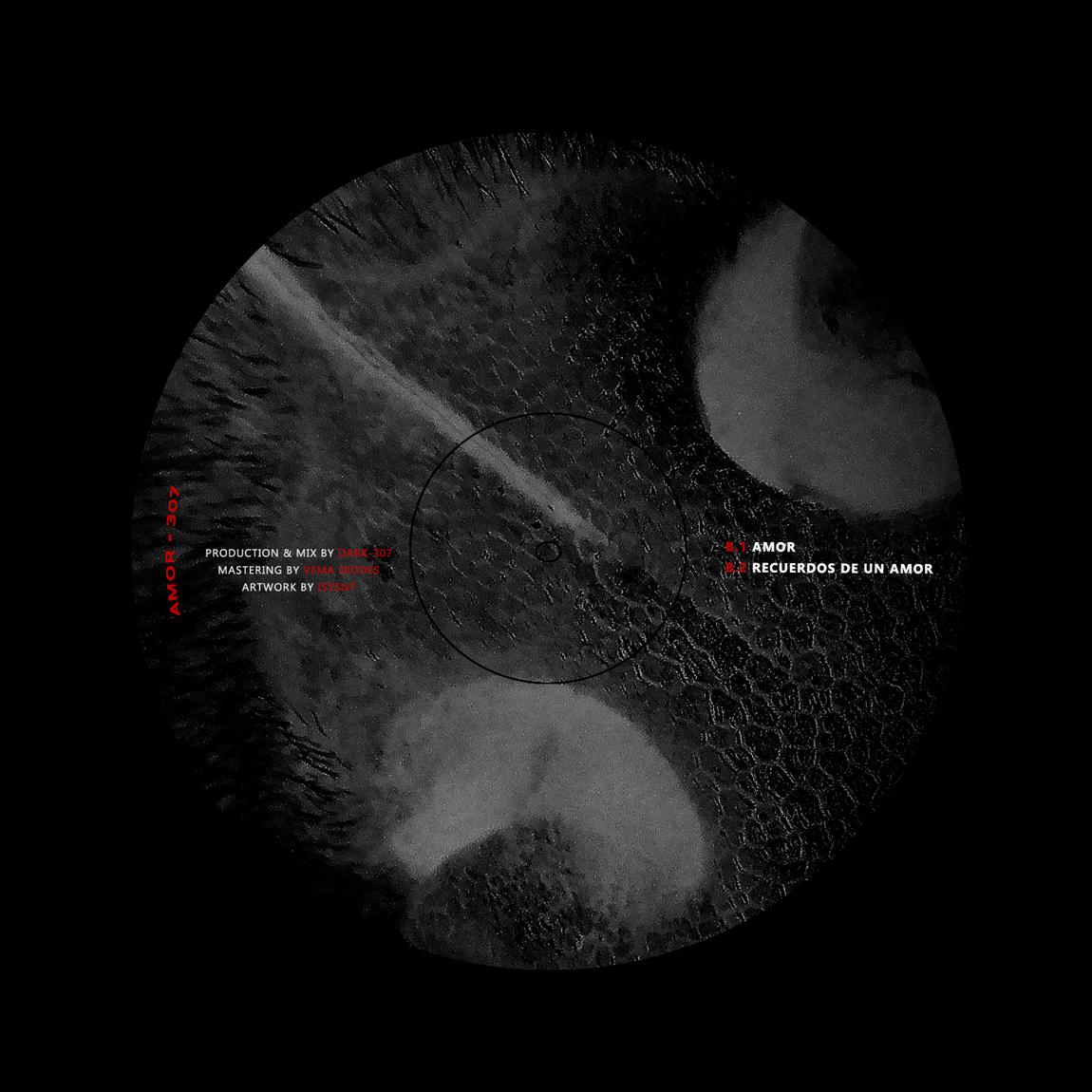
A tribute record built from fragments of a dog that is never shown.
The brief
A record made after the loss of the artist’s dog. Grief packaging usually ends up as a portrait or a black sleeve.
The idea
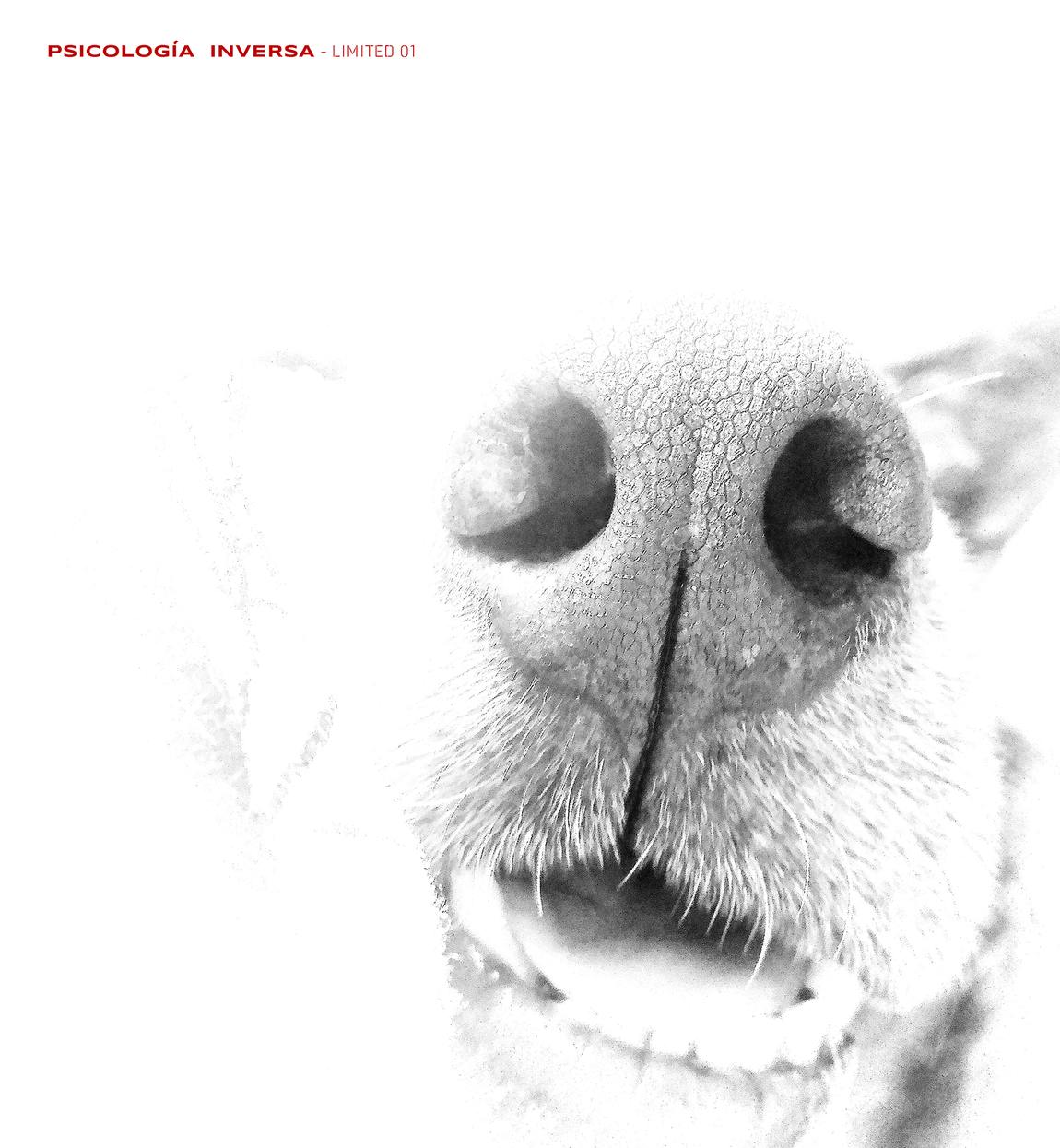
Refuse both. Show only fragments, the nose and the paw print, and let white carry the absence.
Psicología Inversa


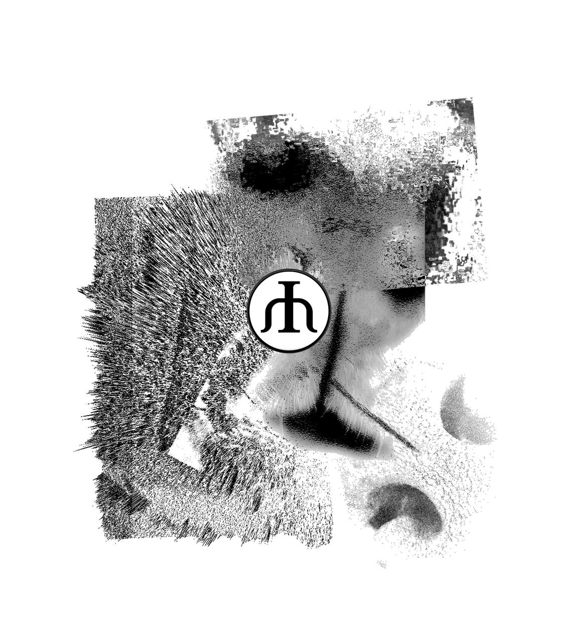
Side A is the memory as it was. Side B is the same image broken apart.
The paw print sits at the centre, so the spindle hole lands inside the pad.
More sleeves


What I delivered
Result
Five sleeves that share a method: find the one image that carries the record, then decide how much of it to withhold.
Start a similar projectBrand identity
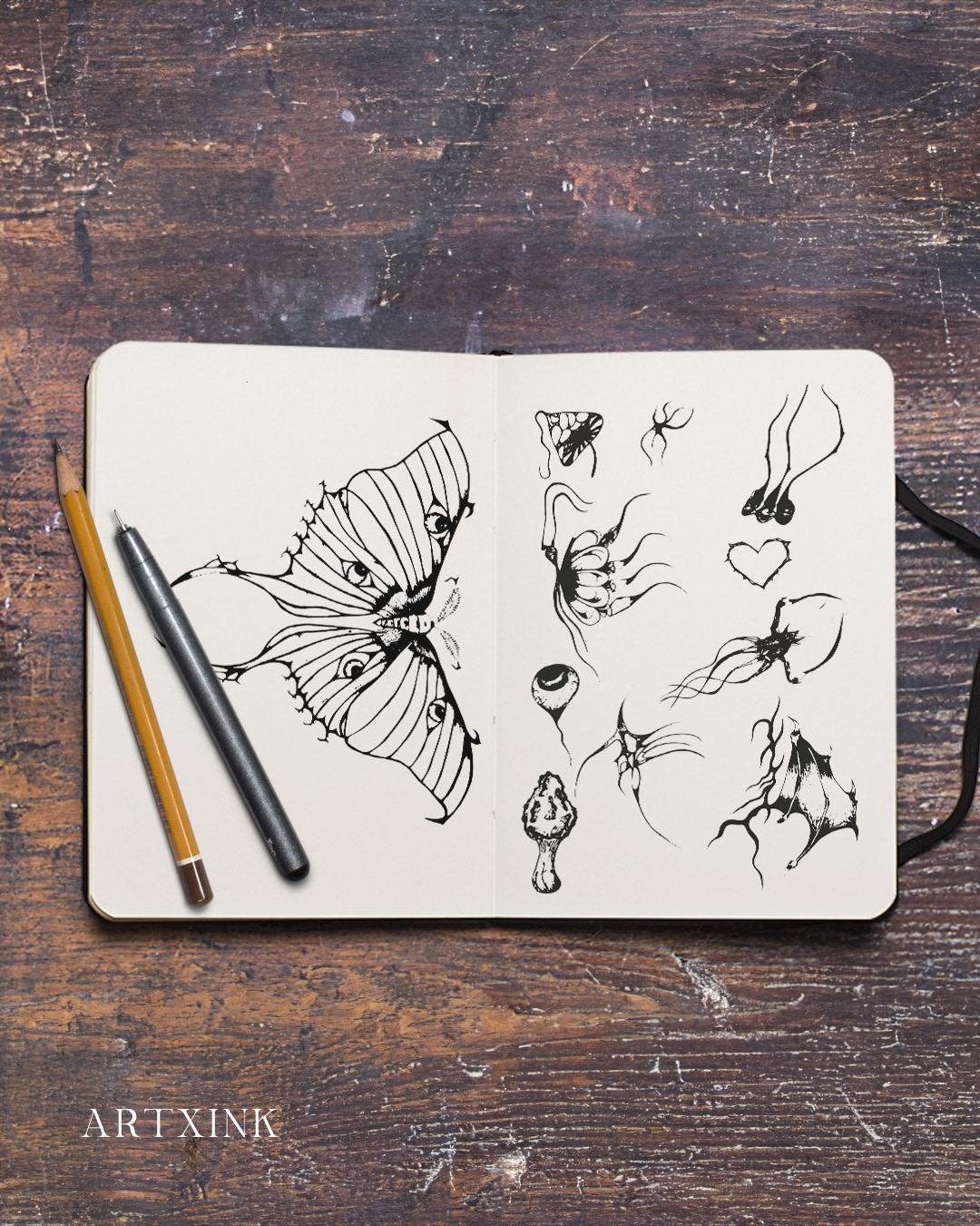
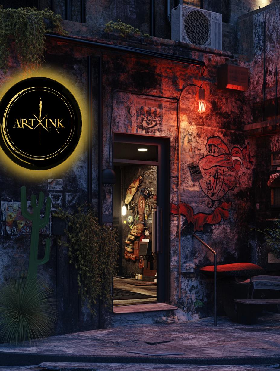
A tattoo practice. The identity is written like a mark.
The brief
An artist with a strong personal universe, mythological beings in fine line, and no brand that came from it.
The idea
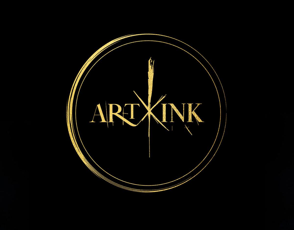
Start from the flash. The X cuts into the word like a mark on skin, and the vertical stroke reads as needle and brush at once.


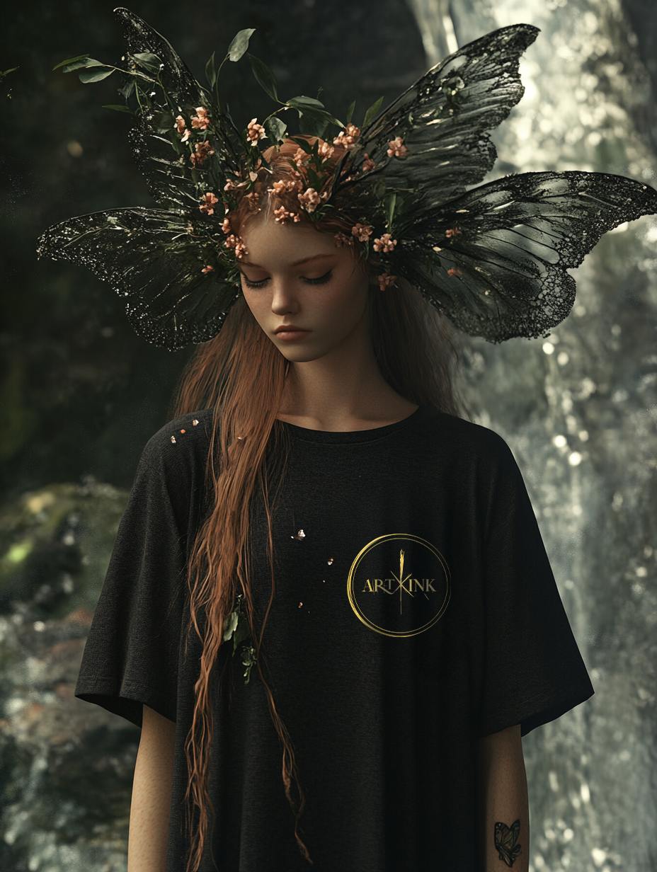
Gold on black works on every surface the brand lives on: dark walls, dark garments, dark glass.
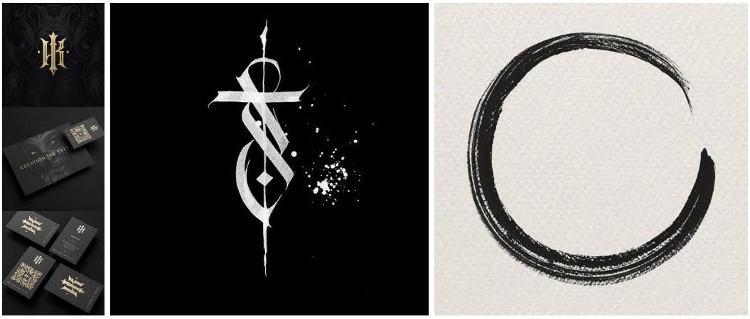
A reference board fixed the register before drawing: ritual, not horror.
What I delivered
Result
An identity that reads as part of the artist’s own drawing rather than packaging around it.
Start a similar projectIdentity & brand book
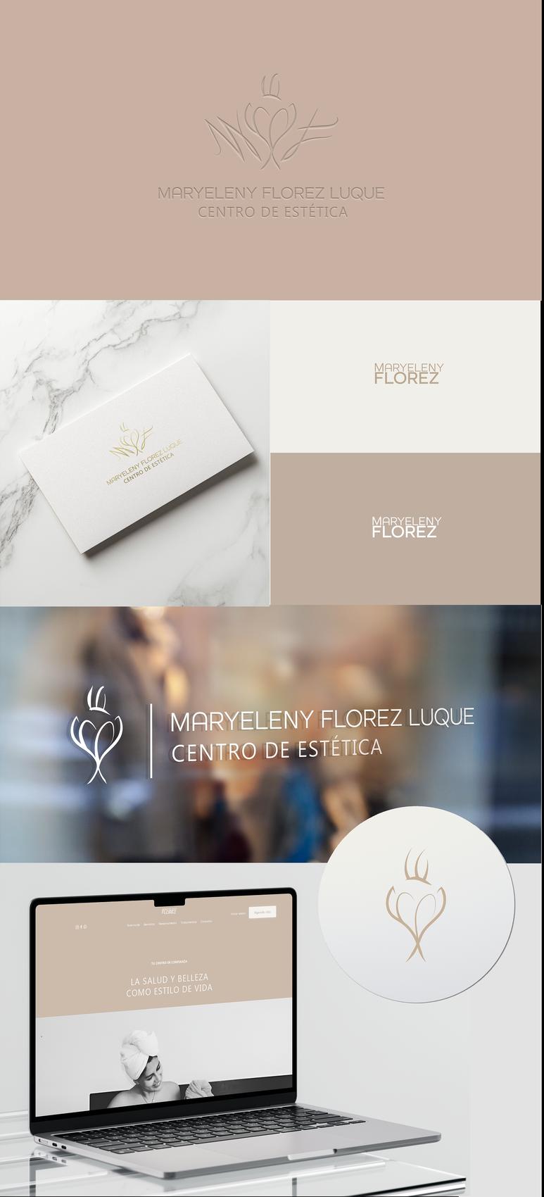
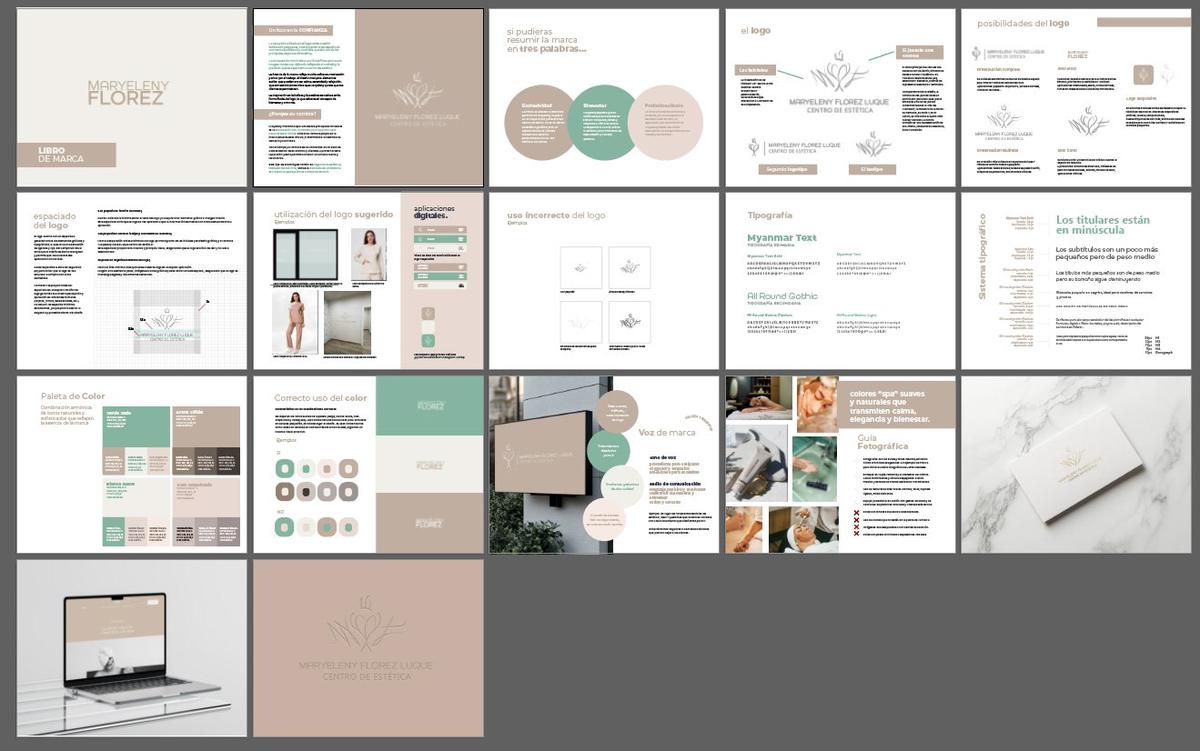
An aesthetic clinic built on care as method.
The brief
A sector that sells results, and a founder who wanted to sell trust.
The idea
Beauty as a consequence of health. One continuous line holds three readings: the founder’s initials, a lotus, and a crown of three lines for her three pillars.


No fill and a single line weight, so it survives embroidery, gold foil and shopfront vinyl.
It is what a client looks at for the whole appointment, so the symbol sits small and tonal.
What I delivered
Result
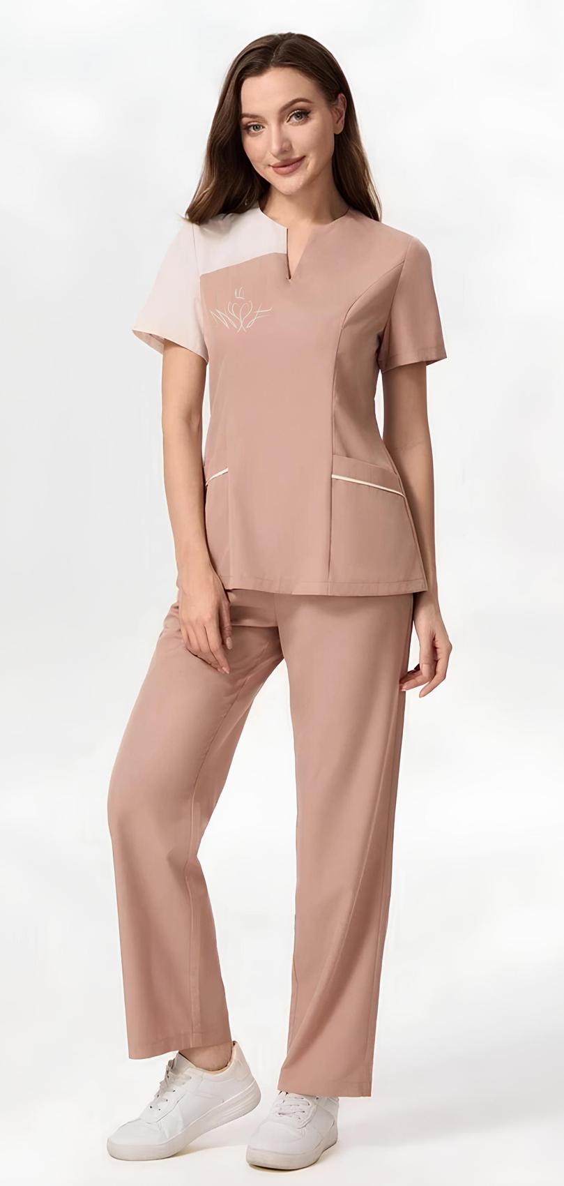
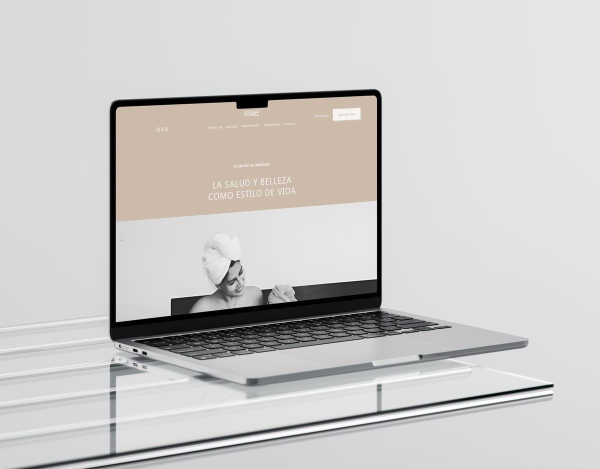
A clinic that opened with its rules already written, applied from card to uniform to web on day one.
Start a similar projectEvent identity & merch · 2023
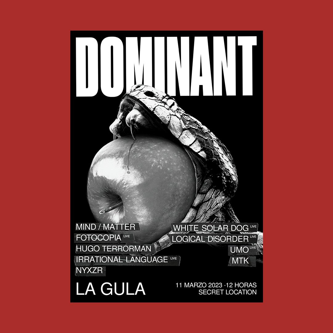
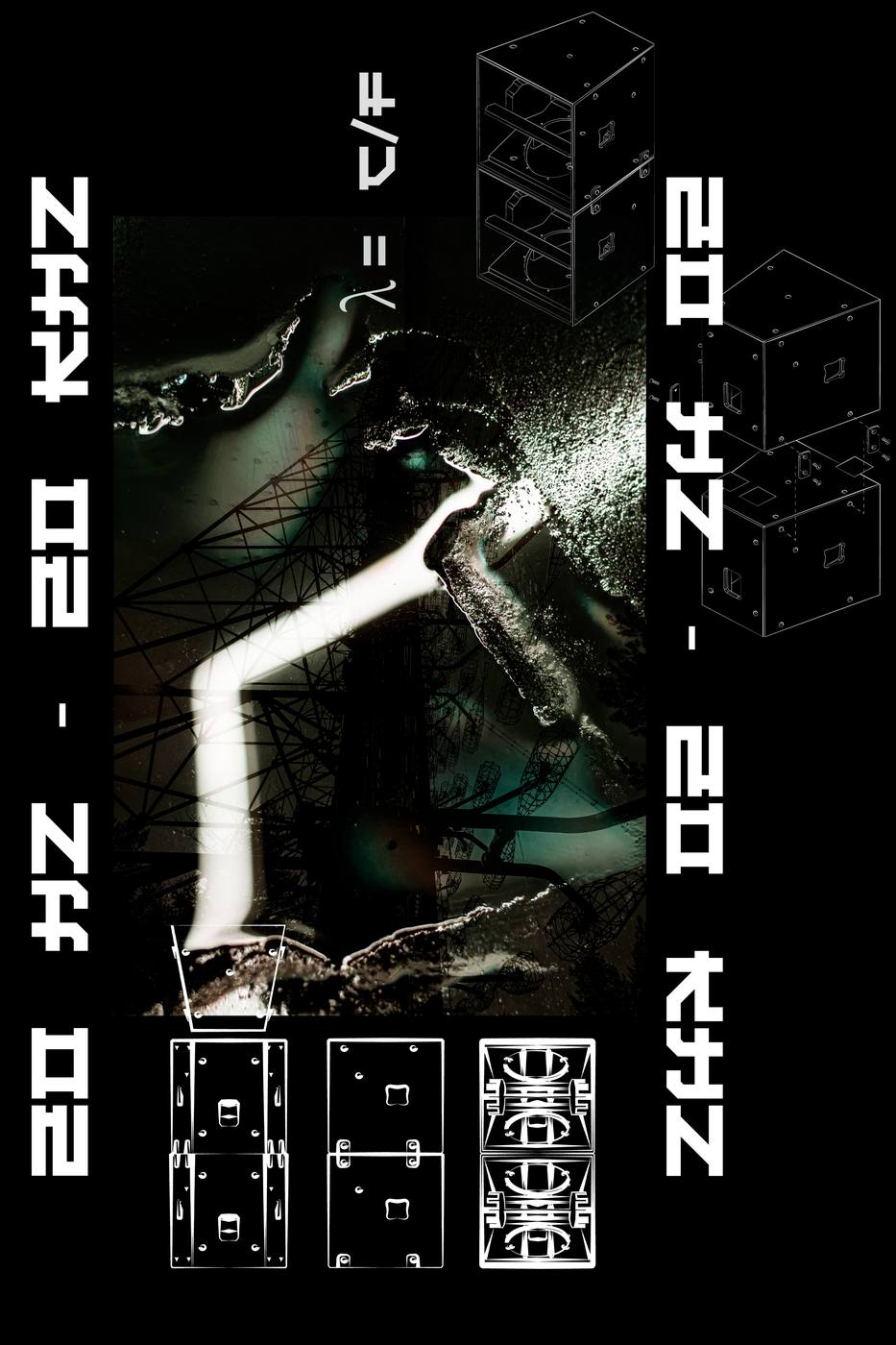
Electronic events in Barcelona. Each anniversary is one chapter of a seven-part series.
The brief
A third anniversary in a series built on the seven deadly sins. This chapter: gluttony.
The idea
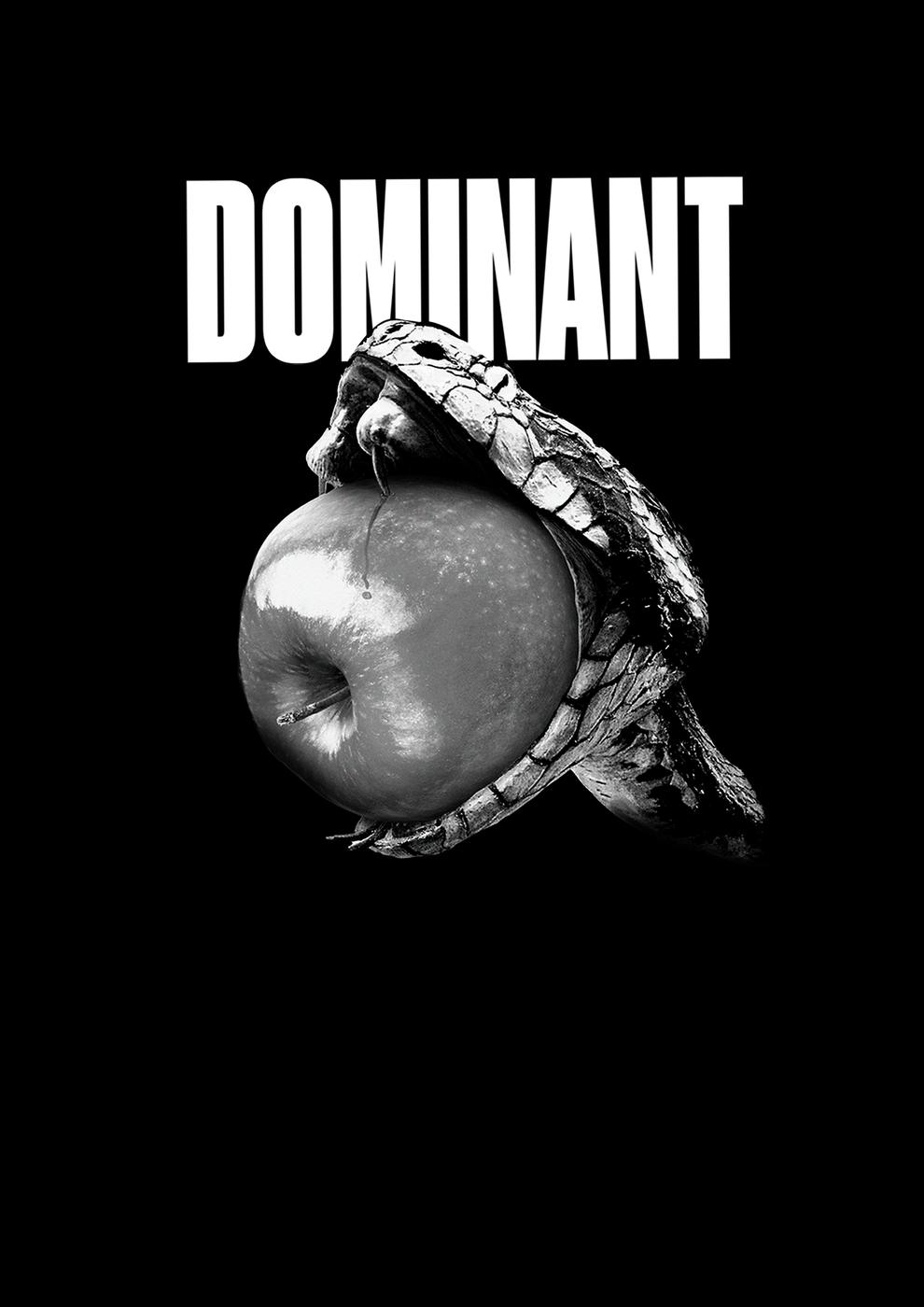
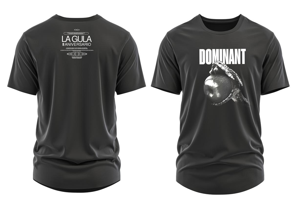
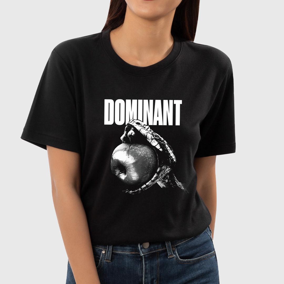
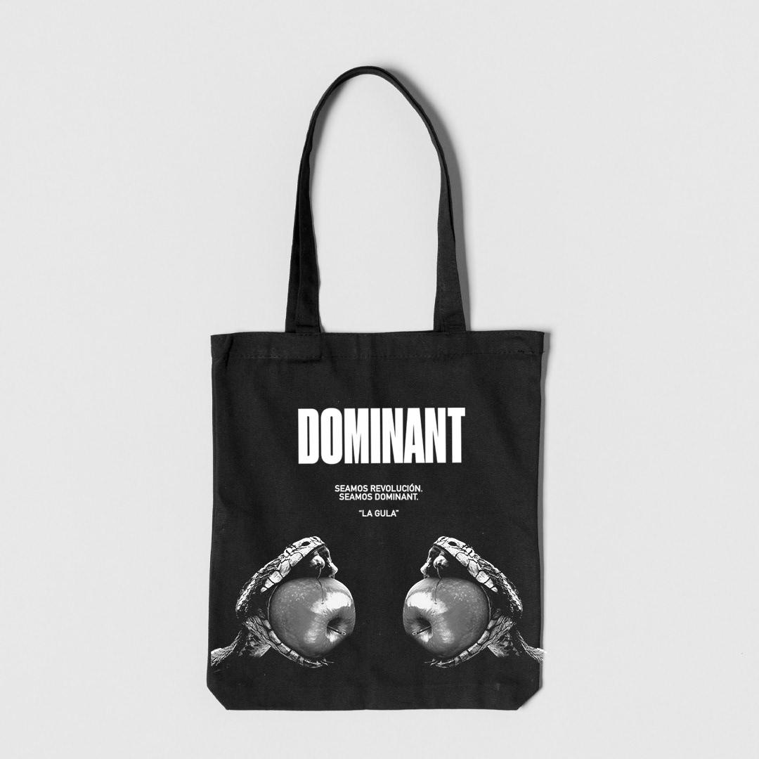
Skip the buffet and go to the origin: the apple and the serpent. Temptation before consumption.


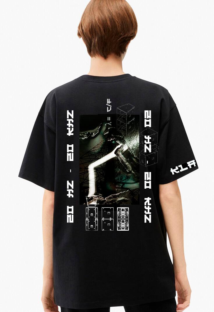
The cut-out was built transparent, so the same image drives poster, shirt, tote and social.
The manifesto goes on the garment. The line-up goes on the poster.
What I delivered
Result
A chapter identity that marks its moment and is built to be replaced by the next one without breaking the series.
Start a similar projectIdentity & event system · 2022
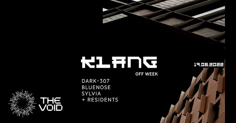
An electronic music project in Barcelona. The identity draws sound itself.
The brief
A project built on sound quality needed an identity about sound, not about a genre.
The idea
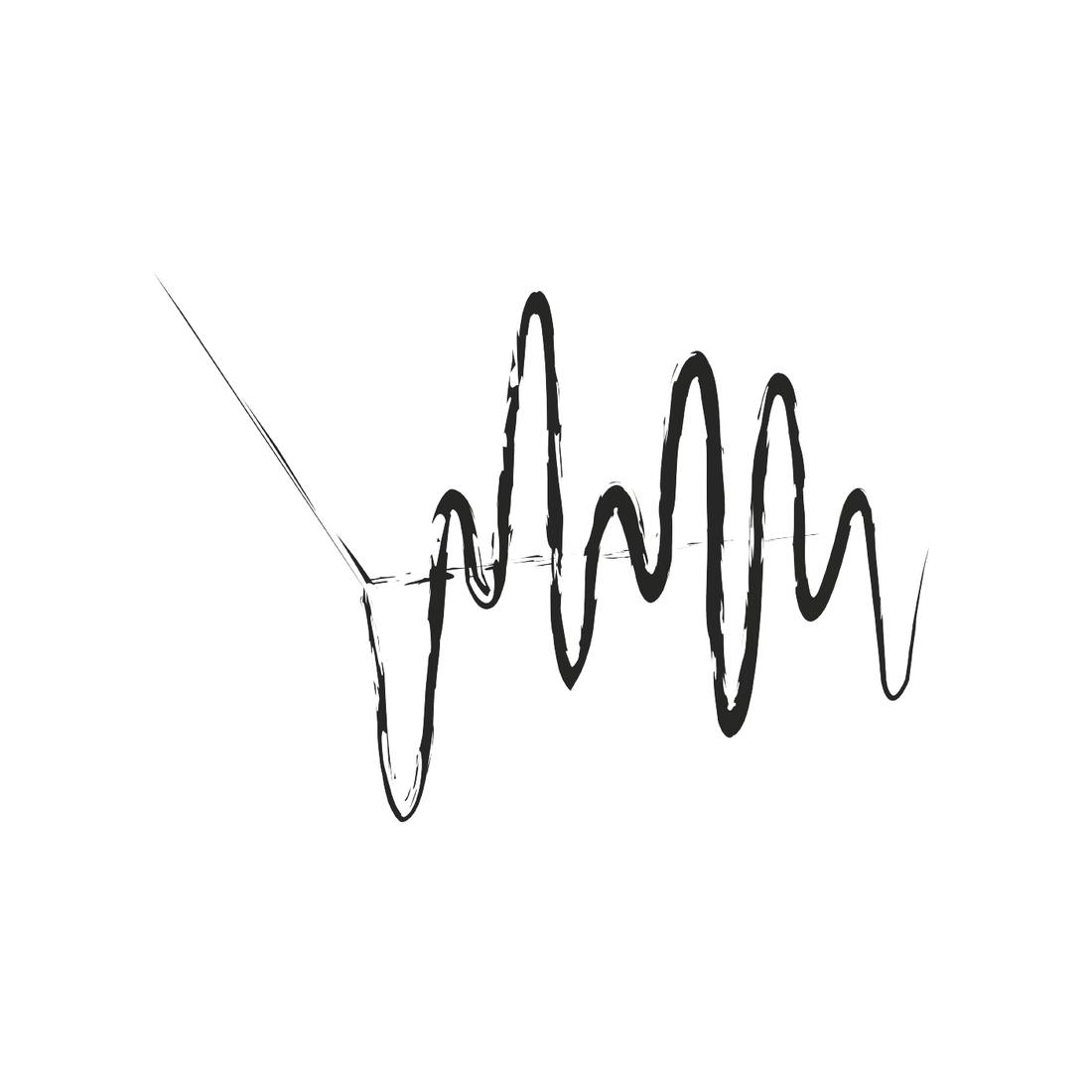
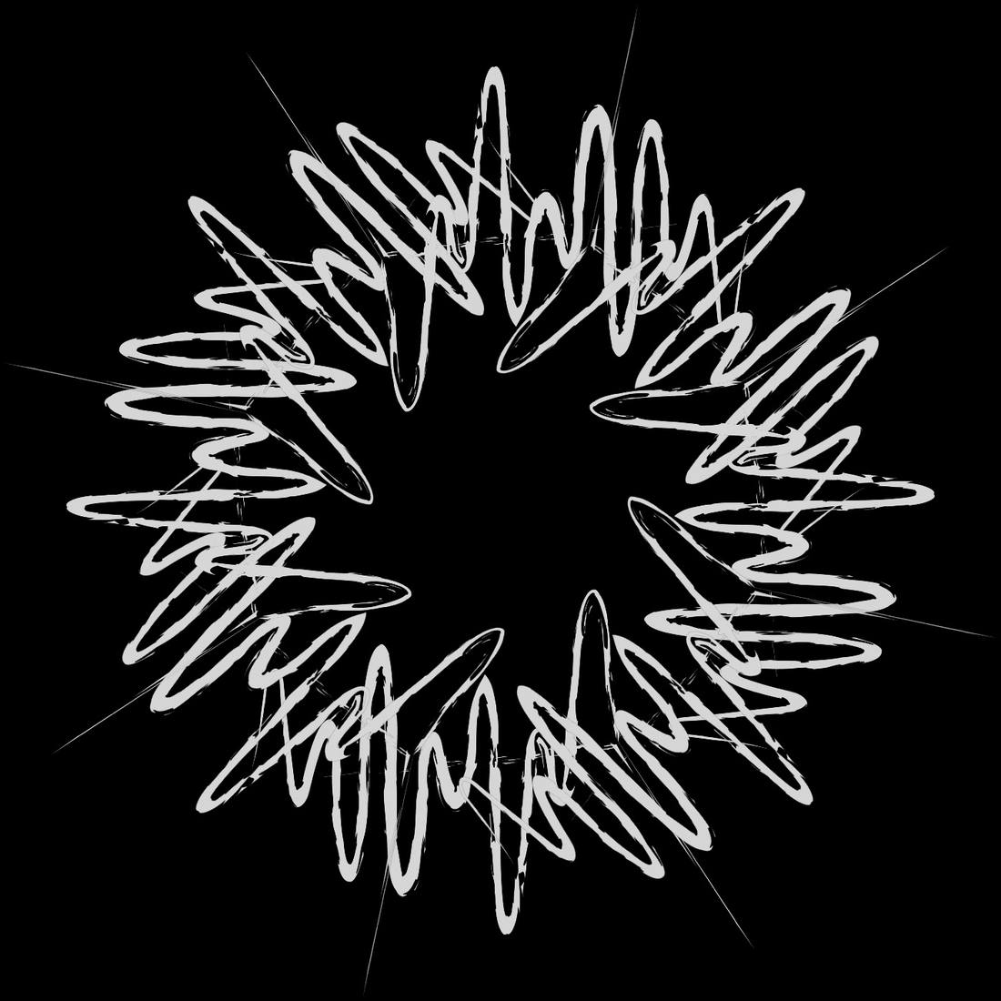
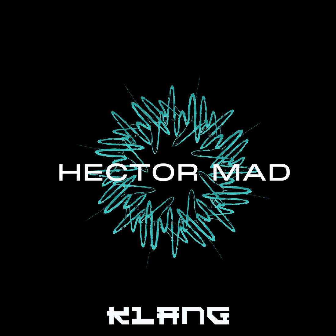
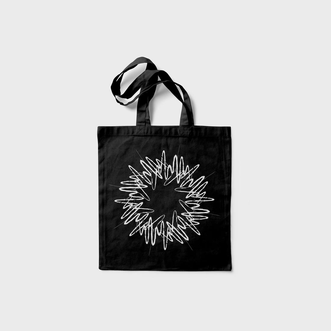
Measure, then sound, then structure. A metronome needle crosses a waveform, and the waveform closes into a radial mark.
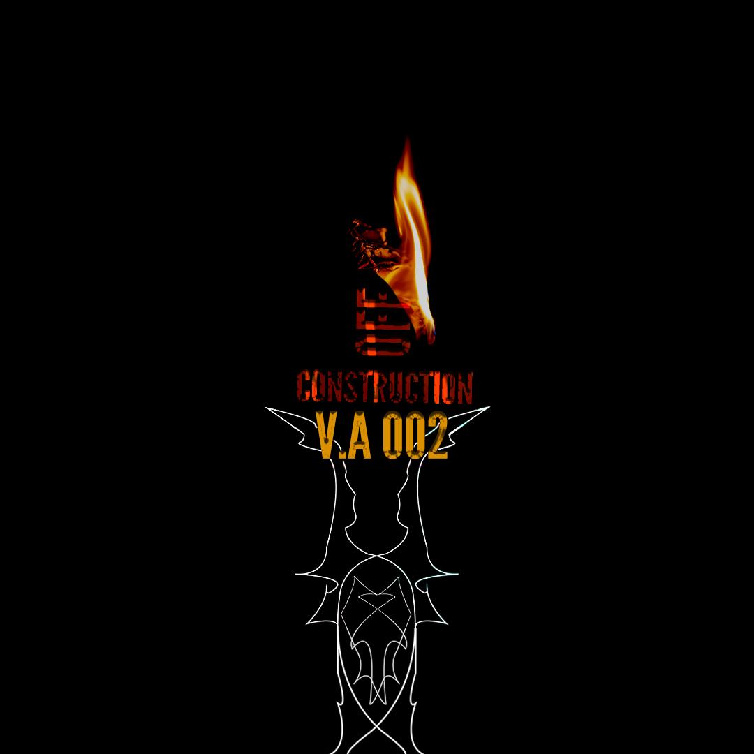
Construction


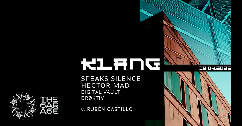
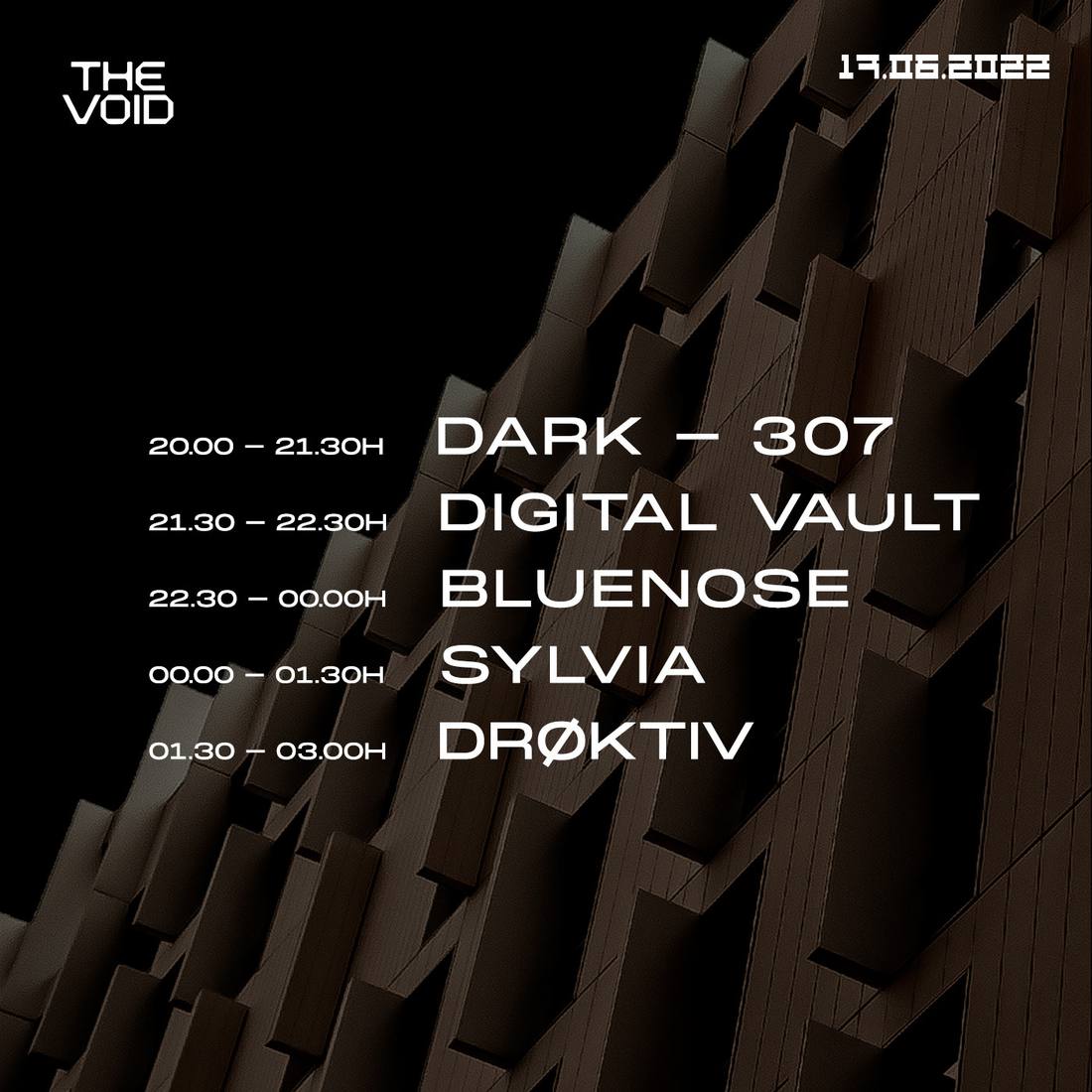
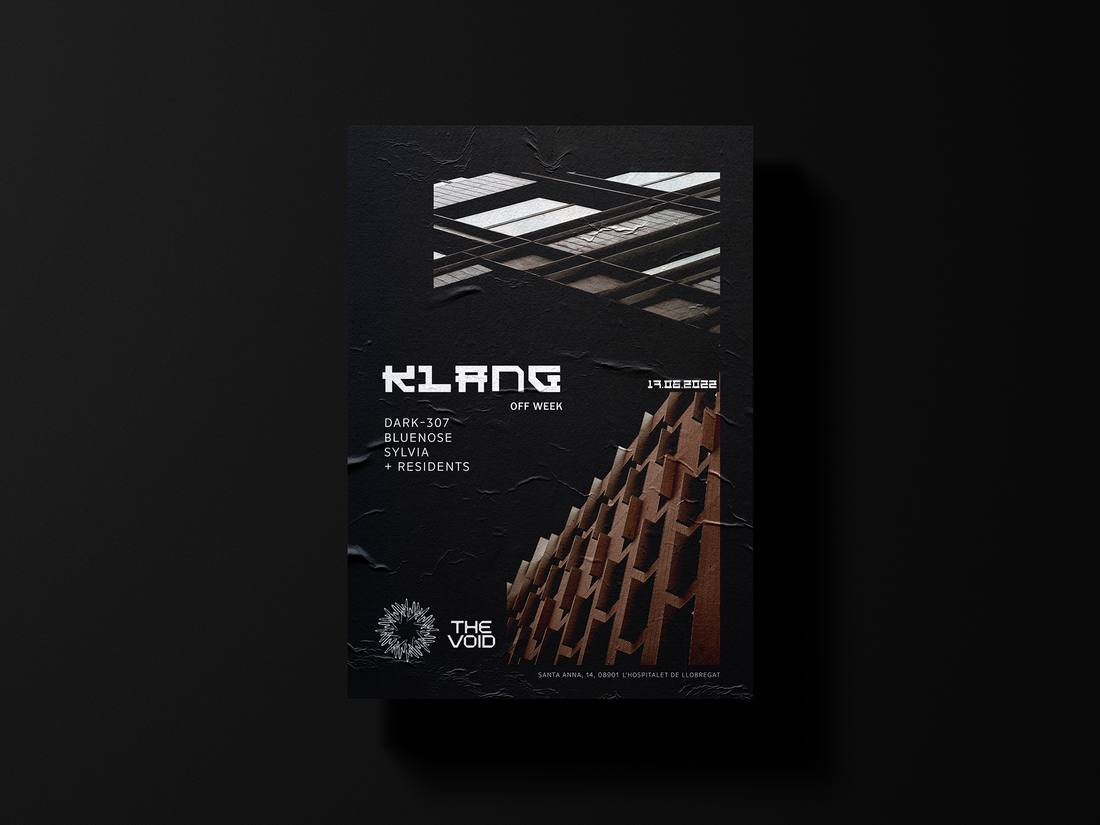
Every event keeps the mark and the hierarchy. Only the architectural photo and its colour change.
Shot in Barcelona and Berlin: where the project comes from, and what it measures itself against.
Events


Merch


What I delivered
Result
One symbol, one wordmark, one hierarchy, carried across every event with only the image changing.
Start a similar projectEvent posters · 2024
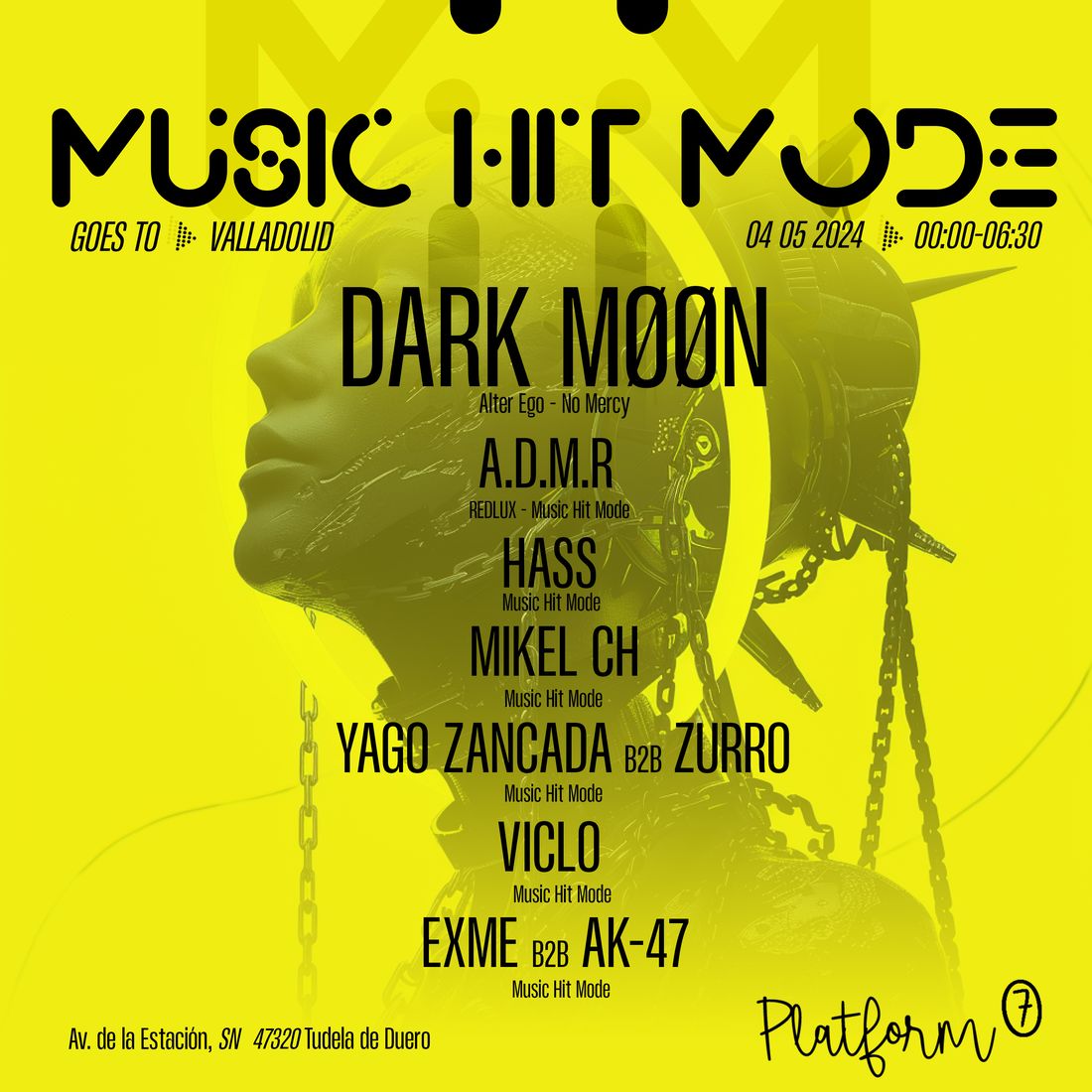
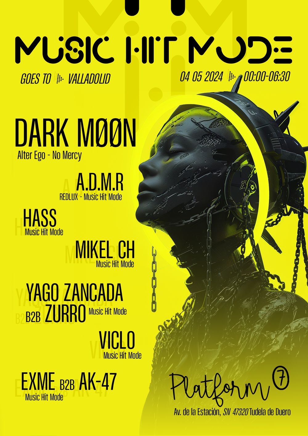
An electronic label on tour. One date in Valladolid, eight acts, two formats.
The brief
A label night landing in Valladolid with a headliner and seven more acts. The same piece had to survive a phone feed and a printed wall, with the whole line-up readable in both.
The idea
Make the line-up the artwork. One acid-yellow field, one chained figure printed into it, and the names set in the same black so they read as part of the image rather than a list laid over it.


Square centres the names over the figure for the feed. Vertical moves the figure right and stacks the names left, each one ghosted behind itself.
Every artist keeps their label line under the name at a fixed ratio, so eight acts fit without the poster turning into a list.
What I delivered
Result
One night carried by a single image in two formats, with a hierarchy the label can re-run on the next date by swapping the figure and the names.
Start a similar projectVisual identity refresh · 2025
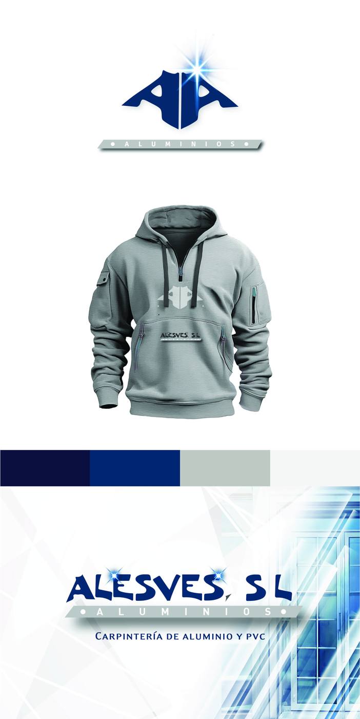
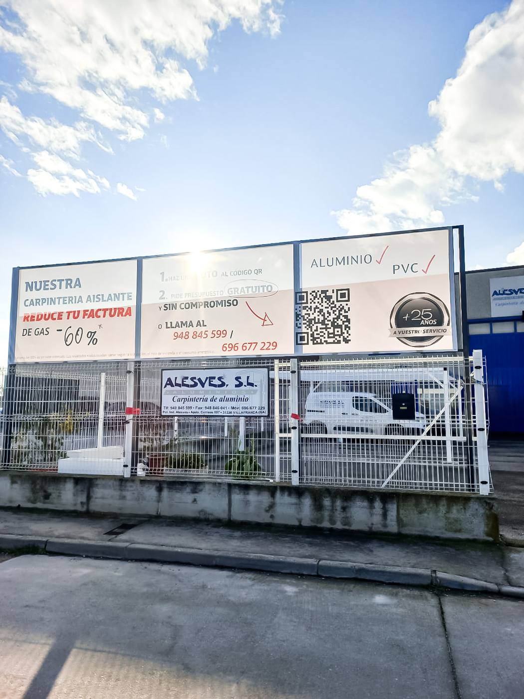
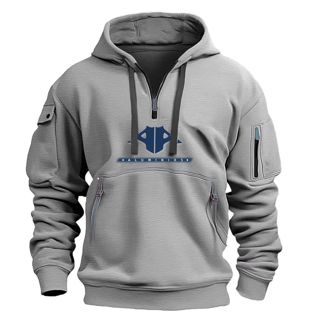
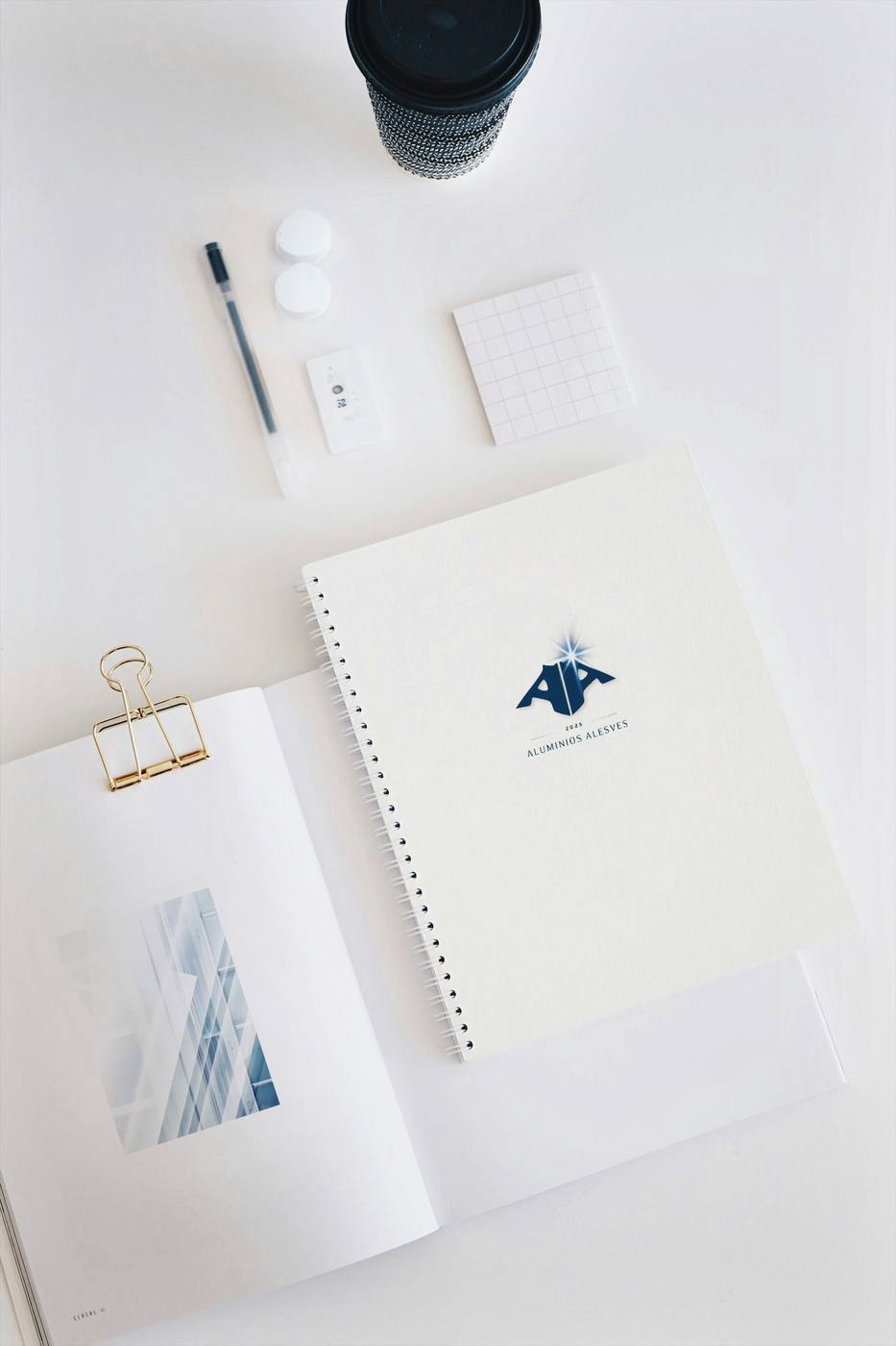
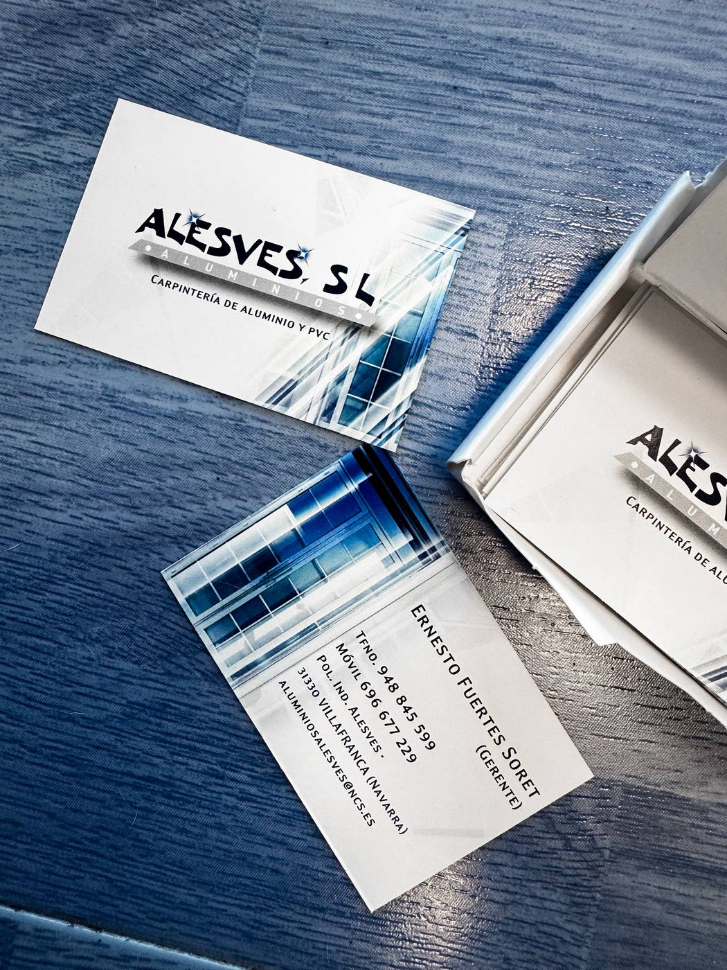
Aluminium and PVC carpentry, 25+ years. Modernise without breaking recognition.
The brief
A company known through its vans, signs and word of mouth. A full rebrand would have thrown away its biggest asset.
The idea
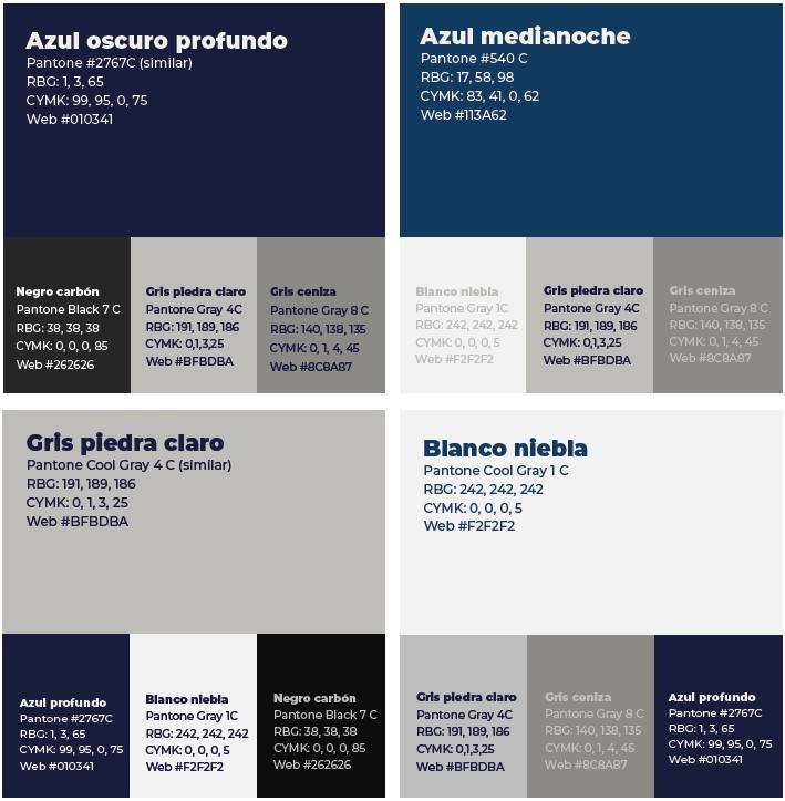
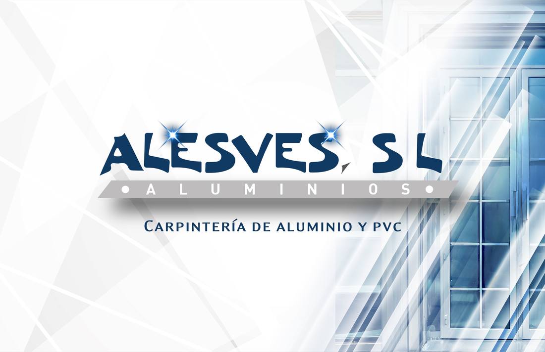
Keep the structure and the blues. Rebuild everything around them properly.


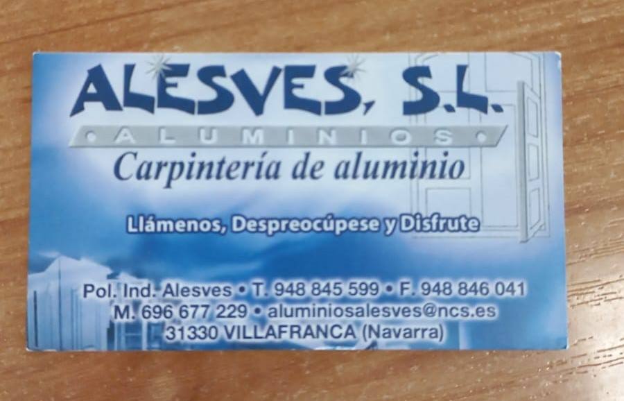
Before / After


Same name and colours, rebuilt with a clear hierarchy.
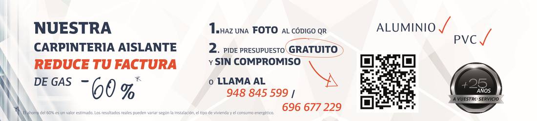
It leads with the customer’s gas bill and routes straight to a quote by QR or phone.

What I delivered
Result
Every asset in service kept, with a specified system behind it and pieces built to bring in quotes.
Start a similar project